ABOUT THE PROJECT
Book My Show is a website that allows users to book tickets for movies, plays, concerts, sports and many other events.
Several millions of customers visit the Book My Show website to make bookings or reservations. The website's powerful functionality clubbed with nice visuals allows users to have a good experience. However, the website is not without its flaws.
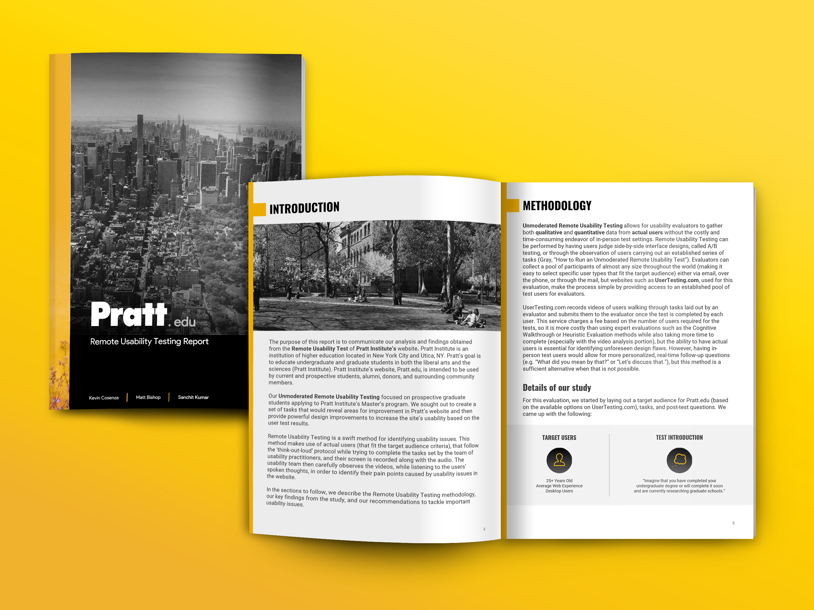
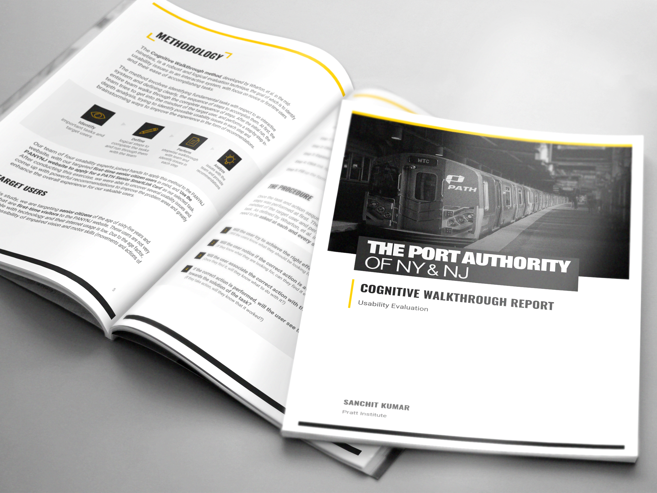
I performed a Heuristic Evaluation on the website to evaluate its usability and unearth potential pain points. With my usability expertise, I also came up with recommendations to tackle the discovered usability issues to improve the overall user experience of the website.
Disciplines
Heuristic Evaluation, User Experience Design (UI/UX), Prototyping, Usability
Our Team
Sanchit Kumar (Primary Evaluator)
JiSun Hong (Secondary Evaluator)
Hanyu Zhang (Secondary Evaluator)
My Role
Defined scope and tasks for best possible coverage of important segments of the website.
Conducted heuristic evaluation guided by defined tasks and Nielsen's ten heuristics.
Organized and led the Heuristic Evaluation sessions with secondary evaluators.
Gathered and analyzed all findings (Own results + Secondary evaluators' results)
Designing and creating the final report
Final Deliverable
The following final deliverable was submitted -
Full Heuristic Evaluation Report
THE METHODOLOGY
The bookmyshow website was evaluated by our team of three usability experts, under my leadership.
Nielsen's ten heuristics were selected as the criteria for usability evaluation, which are as follows:
Jakob Nielsen's ten heuristics
I defined the following tasks to ensure excellent coverage of the bookmyshow website's interface:
Tasks defined for the evaluation
The severity scale chosen to classify the heuristic violations uncovered in the study was as follows:
Severity rating scale
FINDINGS & RECOMMENDATIONS
We uncovered a total of 15 usability issues, out of which 2 were categorized under Major severity level, 12 under Minor and 1 under Cosmetic:
Severity breakdown of usability issues uncovered
From the set of all the uncovered usability problems, I selected the most important problems
Recommendation #1: Improve usability of the first time visit promotion screen by using a pop-over on the homepage
The Problem
The first time visit of the homepage has poor usability due to the following reasons:
Problems found - First Time Visit - Part 1
Problems found - First Time Visit - Part 2
The Recommendation
I came up with the following recommendation to improve the usability of the interface:
Recommendation #1: Improve usability of the first time visit promotion screen by using a pop-over on the homepage
Recommendation #2: Improve usability of the region selector box by strengthening its call to action and making it more discoverable
The Problem
Usability issues were found on the homepage, after the first-time visit pop-over was dismissed. The problems found were as follows:
Problems found - Homepage
The Recommendation
I came up with the following solutions to help improve the usability of the interface:
Recommendation #2: Improve usability of the region selector box by strengthening its call to action and making it more discoverable
Recommendation #3: Improve usability of the search bar by hybridizing a conventional search bar with a quick links feature
The Problem
Usability issues were found with the search feature as highlighted below:
Problems found - Search Feature
The Recommendation
I came up with the following solutions to help improve the usability of the interface:
Recommendation #3: Improve usability of the search bar by hybridizing a conventional search bar with a quick links feature
CONCLUSION
The heuristic evaluation is a quick and cost-effective way of evaluating the usability of an interface. The process does lead to considerable usability improvements due to the expertise of the usability evaluator. However, it is important to note that Heuristic evaluation is a discount method of usability evaluation, and substitutes expertise instead of actual user feedback. Involving users in the process is the most effective and powerful usability test process, but tends to be more costly. However, the results are accurate, and therefore, worth the time, money and effort.
--- THANK YOU! ---


