About the Project
This project was about reinventing the file system and to provide a highly improved experience of organizing and managing files on desktops and laptops. The target audience for this project was professors or teachers, that have to deal with a lot of files on a daily basis. They also often teach multiple classes along with conducting their own research among other things, and hence they really need to stay organized with their materials without investing too much time into it. To solve this problem, we designed Localbox, a desktop (or laptop) application that redefines the traditional file system which hasn't been improved in a long time.
Disciplines
User Research (User Interviews + Observation), Ideation & Brainstorming, UX/UI Design, Wireframing, Prototyping, Interaction Design, Visual Design, Project Management
Tools
Pen & Paper, Balsamiq, Sketch, Adobe Photoshop, Marvel App
Project Timeline
15 Weeks - (Spring 2018)
User Research
User Interviews
To kick off this project, and to really understand what the pain points are, we conducted 5 semi-structured interviews both in-person and telephonic with graduate school professors.
Observations
To understand how professors use their file system and how they like to organize their files, we gave our 5 interview participants 2 tasks each to perform on their personal computers and in their own office and observed their behavior, their expressions and their series of actions. We also asked them to think aloud, so that we could better understand what they were experiencing.
Research data Analysis
User Journey Mapping
Our first step to understand the research data, was to map out the users' journey based on the tasks they performed. Based on what information we had gathered about the user's behavior and actions, we laid out the series of steps they take to organize material before a lecture and exposed the emotions / feelings that they expressed at each phase. We also looked for opportunities where we could help users ease their pain points.
Research Synthesis: User Journey Map
Key Findings
After we had mapped the user journey, we were able to gather some key insights -
Key Finding 1: Organizing physical material the old school way makes professors unhappy as it is messy and time consuming
Key Finding 2: Professors often work with a large number of documents and it is easy for them to lose older files.
Key Finding 3: Professors want an easy way to share files with their students, especially since now the digital age has made everything so much faster and easier.
Key Finding 4: Professors often teach multiple classes and hence have a lot to keep in mind with respect to their course materials / documents, which is stressful.
The Solution
Initial Ideation
During our initial ideation session, we did thorough research on what technologies we could leverage to make our product's features extremely powerful. We found several powerful cloud-based services that could make our product amazing - Google's Vision API and Natural Language Search API. Our idea was to create a digital assistant that would help organizing, searching, and managing files.
Project Critique - Learn Early, Learn Often
After we had thought of our initial idea and direction, it was time to get our progress critiqued by a group of 2 product managers and 2 technical leads, that were invited over for our project. Through their vast knowledge of product delivery, we learned from them that the technologies that we had leveraged during our initial ideation would significantly raise costs to get the product built, due to two factors -
1) Google Vision and Natural Language Search API costs were quite high.
2) The technical implementation of these APIs would require a huge amount of development effort that would increase the cost by a lot.
It was helpful to learn the feasibility of our ideas so early on in the project and it gave us plenty of time to realign ourselves towards along a new path. This led to another ideation and brainstorming session.
Informed Ideation: New Feature-set
After our initial critique, we learned that we must carefully consider the cost of technology for feasibility of the project. Therefore, in order to make an affordable product for professors, we were now sure that the product needed to be technically simple, yet feature-packed.
Keeping this in mind, we brainstormed ideas and came up with LocalBox, an application for desktop computers / laptops, which would have powerful features to ease the pain points of users. Some of the features we decided to include were -
Informed Ideation: LocalBox Features
Interaction Design
After our ideation phase, we moved to the interaction design phase where we first worked on the low fidelity screens using Balsamiq Mockups and then tested them with users to iterate and improve our design's usability.
Low-Fidelity Prototype
Keeping our research data and our feature set in mind, our low-fidelity prototype came together on the Balsamiq Mockups app. Some of the screens can be seen below -
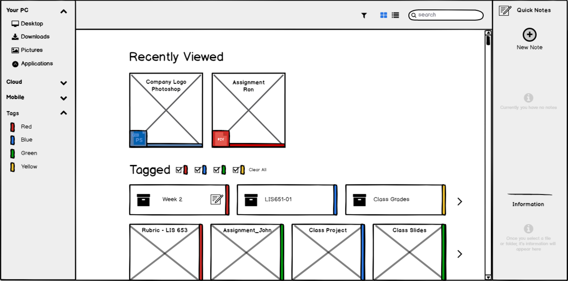
Home Screen
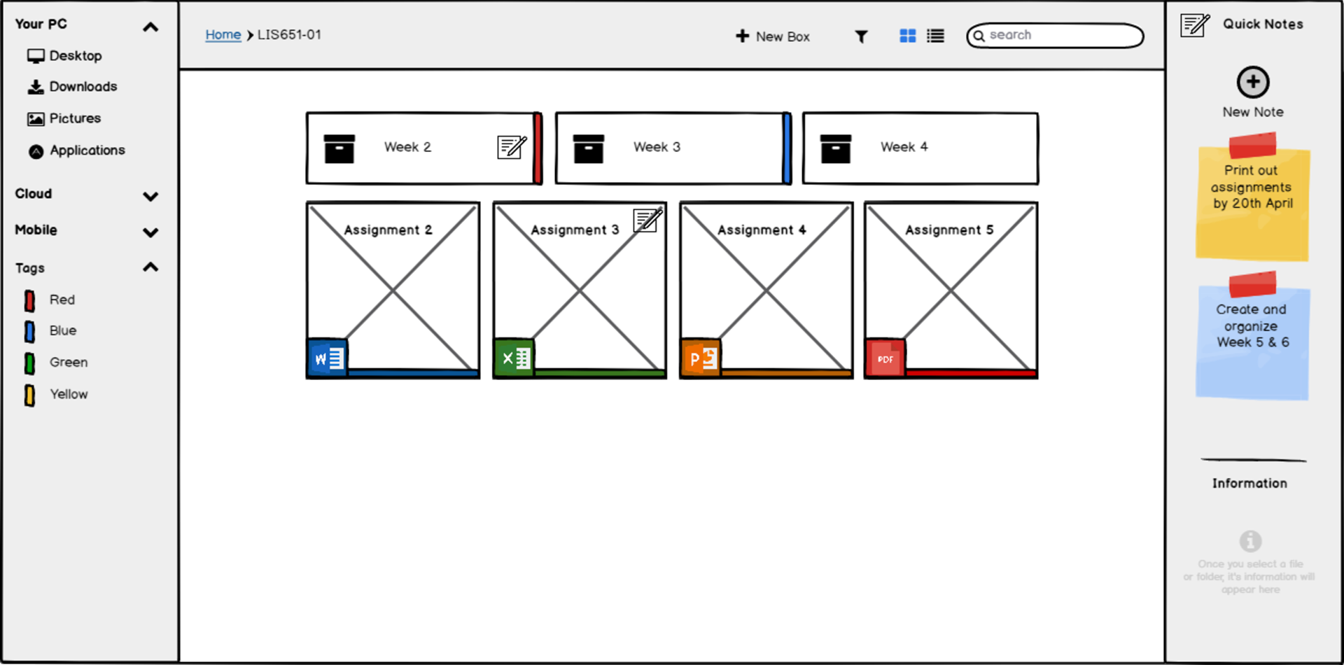
Folder View + Folder Notes
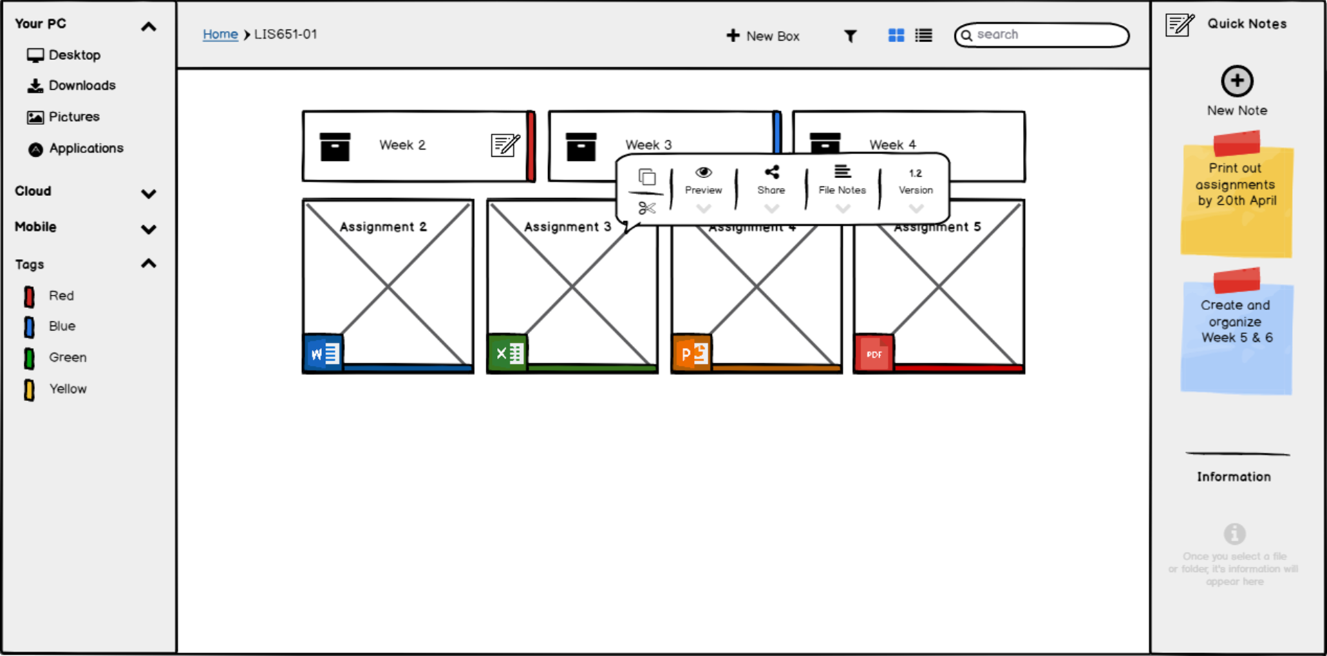
Shortcuts (Hover Menu Bar)
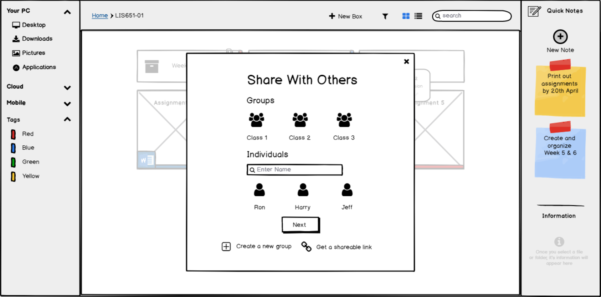
Sharing Documents
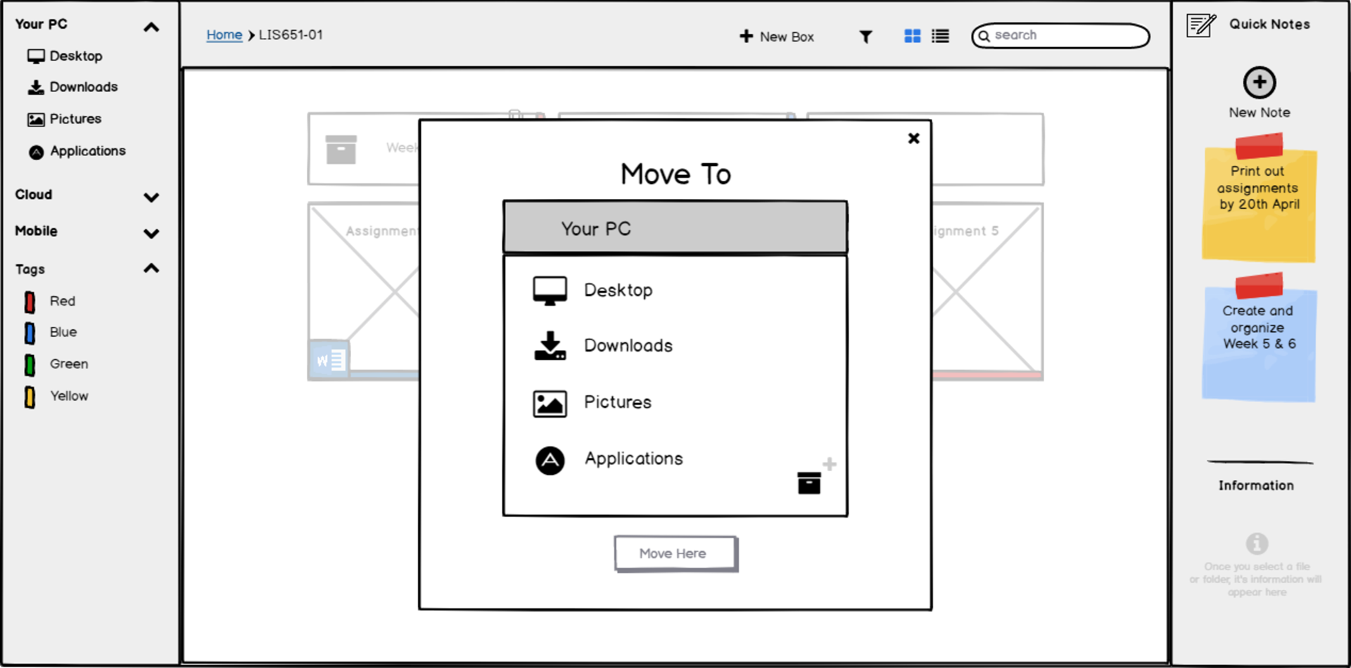
Move Documents
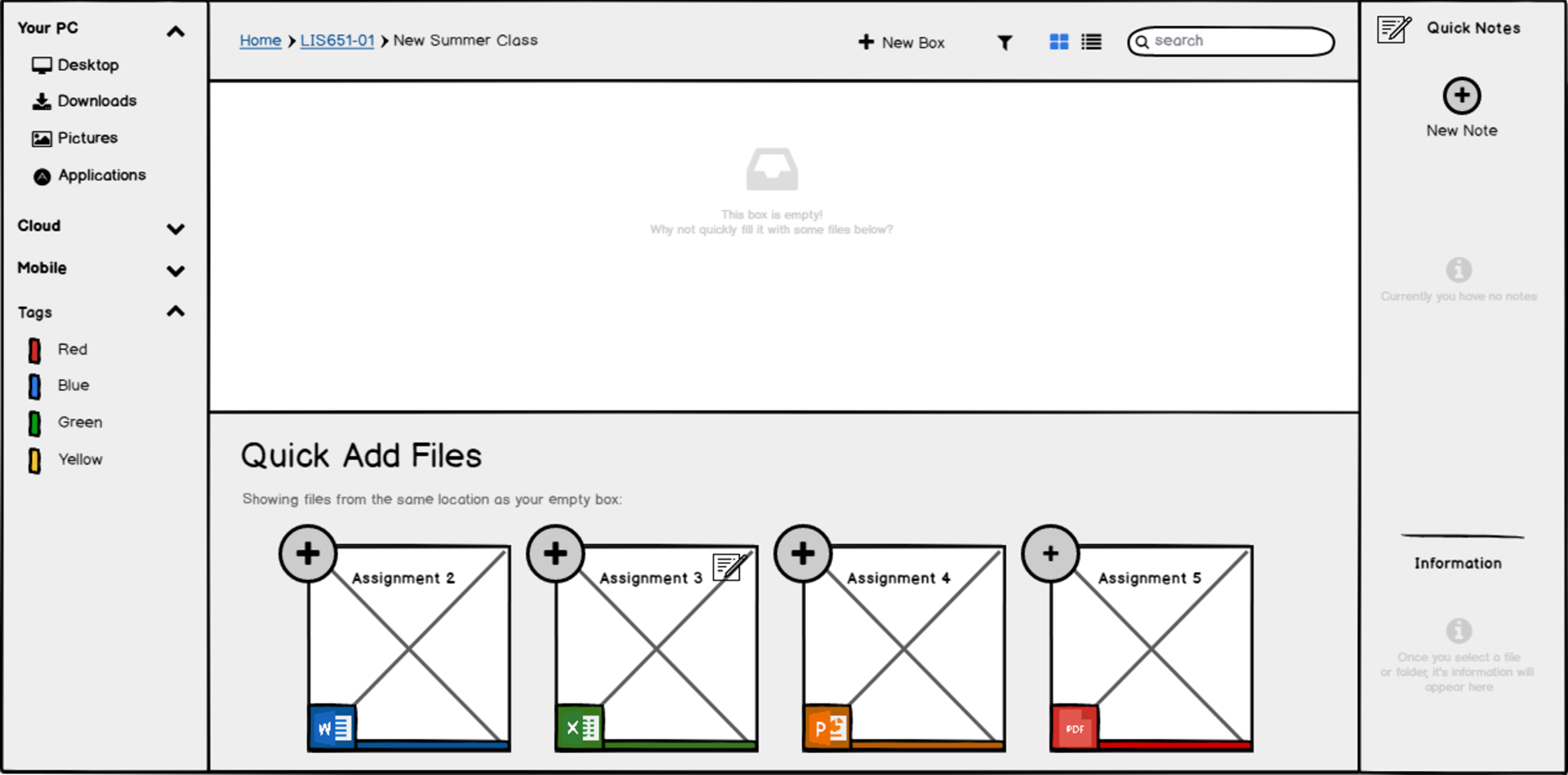
New Folder Quick Add
User Testing
We recruited 4 professors to be a part of our user testing and made them perform tasks on our interface. We asked them to think out loud so that we could understand their pain points better. The key findings were -
Improved Prototype
We improved the prototype based on the user test findings and ran a guerilla user test with 2 participants. This time around, we did not find any issues with the interface, and the only thing the users talked about were the lack of the visual layer and no real images and content. Here is the improved prototype -
High Fidelity Prototype
Final Deliverable: Interactive High-Fidelity Prototype
After we knew our low fidelity prototype was in good shape, we moved to the high fidelity prototype and added the visual layer to the interface. Our final deliverable can be seen below -
Prototype Walkthrough
Here is a walkthrough of our prototype with Professor James, PhD. Human-Computer Interaction, Georgia Tech, who is getting ready for a lecture.
Task 1 - Professor James opens up LocalBox to check the details of a certain document and then heads over to its box to add a note about it so that he remembers to talk about it during his class. However, he then realizes that the note is not needed as this is to be covered next week, so decides to delete it.
Task 1
Task 2 - Professor James wants to share a certain document with his class before the lecture starts, so he decides to use LocalBox for this task.
Task 2
Task 3 - Professor James would like to create a new place where his 'week 3' documents would reside. He uses LocalBox to create a new box.
Task 3
Task 4 - Professor James realizes that a document was probably in the wrong location, so decides to move it to his 'downloads'. Then he realizes that the original location was a better one for the document.
Task 4
Reflection
This project was a great learning experience for me. I learned that it is very important to consider technical constraints and perform a feasibility analysis to understand if certain features could be implemented in a timely manner and still be cost effective. It is also nice to get feedback from experts like Product Managers and Technical Leads to better understand if the MVP is possible, and what features we could include without any risks. Since we designed this app only for Mac, as most of our users were Mac users, going forward I would love to work on the Windows version of this application to also cater to PC Users.
