About the Project
The goal of this project was to create a digital product to improve the experience of people visiting various dine-in restaurants in groups. When our team got together and was talking about the issues some of us faced while placing orders at restaurants that we had recently visited - 'Olive Garden' and 'Chili’s', we thought this is a great opportunity to bring digital to the rescue. Both of these restaurants had tablets at the tables for customers to place their order and pay their checks, but in our experience, using these was not a good experience. These interfaces suffered from poor usability, technical glitches, and an overall lack of interesting features, and this is when we thought that we should come up with a solution to this problem.
The Idea
Our idea was to combine an ordering experience, with a payment and check splitting experience at a dine-in restaurant in the form of a mobile app. We wanted this digital solution to work for any restaurant and plug in to their respective experiences.
The Challenge
Combining an ordering experience, with a payment and check splitting experience was quite challenging, as these are all complex flows individually. Also, it was quite challenging to think of a product that would adapt to each restaurant's experience seamlessly.
Disciplines & Tools
User Research (Interviews + Surveys) & Analysis, Mobile User Experience Design (UI/UX), Interaction Design, Wireframing, Prototyping, In-person User Testing, Adobe XD, Balsamiq.
My Responsibilities & Team
The team for this project consisted of -
> Sanchit Kumar - UX/UI Designer
> Sunayana Kesari - UX/UI Designer
> Dilasha Jain - UX/UI Designer
> Naman Sehgal - UX/UI Designer
My responsibilities were -
> Defining the scope & Strategy + Planning the project
> Conducting User Research (User Interviews and Surveys)
> Delivering solutions through UX Design methods and techniques (Interaction Design, Wireframing, Prototyping, User Testing and Visual Design)
Our Methodology
We kicked off our project with some discussions and planning, while keeping in mind that we needed to understand who our users were and what were some of their pain points. We also wanted to find out if our product was really something users would want to use. With thought of the following methodology to tackle this problem -
Our Methodology
User Research & Analysis
Target Users
Our team discussed the users that we should target. We basically wanted to target anyone who likes to eat at restaurants, and likes to have company.
We also wanted to focus on users that have used apps or websites for any of the following - restaurant menu exploration, food ordering, splitting bills and expenses.
Research Goals
We wanted to understand user behavior and pain points around in-restaurant ordering, check splitting and check payment activities.
For this we thought of first conducting a survey and getting some quantitative figures.
Our Research Goals
Survey
To begin our research, we crafted a survey to send out to people that fit our target audience most. We asked them questions about their typical restaurant visits and about their comfort level with technology. Some of the other questions were also to understand what features would help improve in-restaurant experience. We collected a total of 54 survey responses, some of the key findings of which were as follows -
Survey Responses: Key Findings
User Interviews
Next, we conducted in-person user interviews to understand their in-restaurant needs and what their preferences were when it came to payments and check splitting/payment. To get this started, we created a user interview protocol based on our research goals and interviewed 8 participants that fit our target audience criteria. We also took notes during our interview sessions to gather data.
Research Data Analysis
We analyzed the research data that we had gathered by using the affinity mapping technique, where we thoroughly discussed our individual findings and tried to group them into categories.
Research Data Analysis - Affinity Mapping
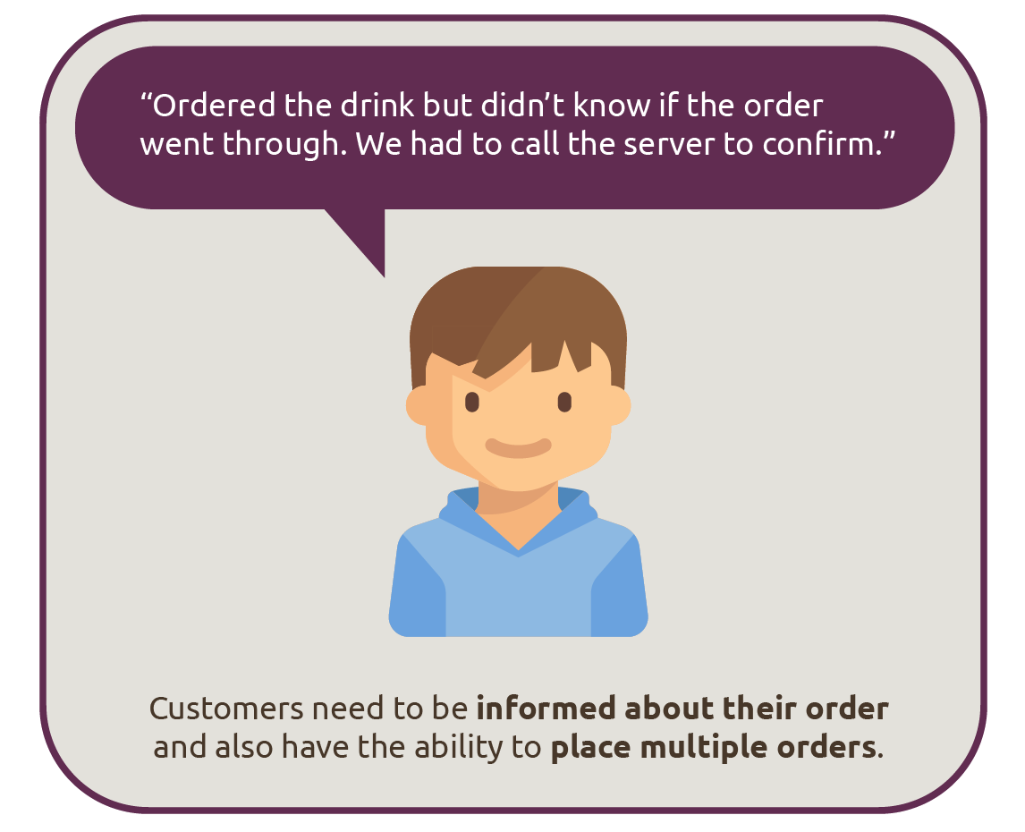
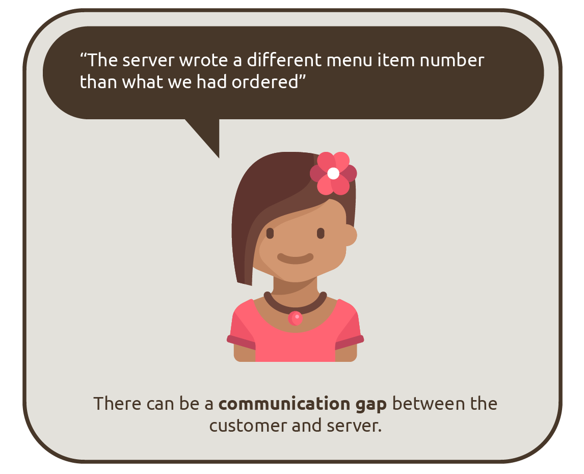
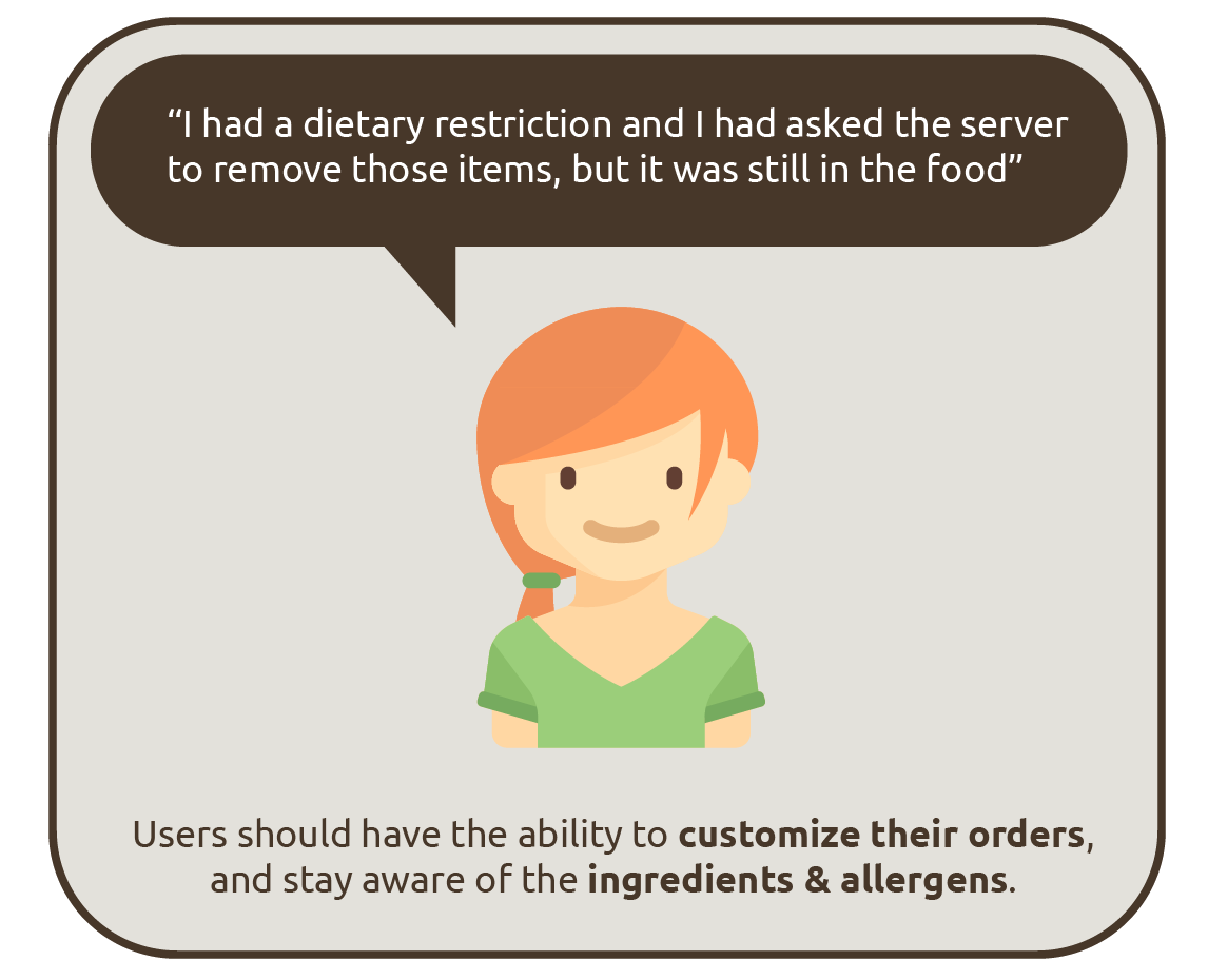
Research Data Synthesis: Key Findings
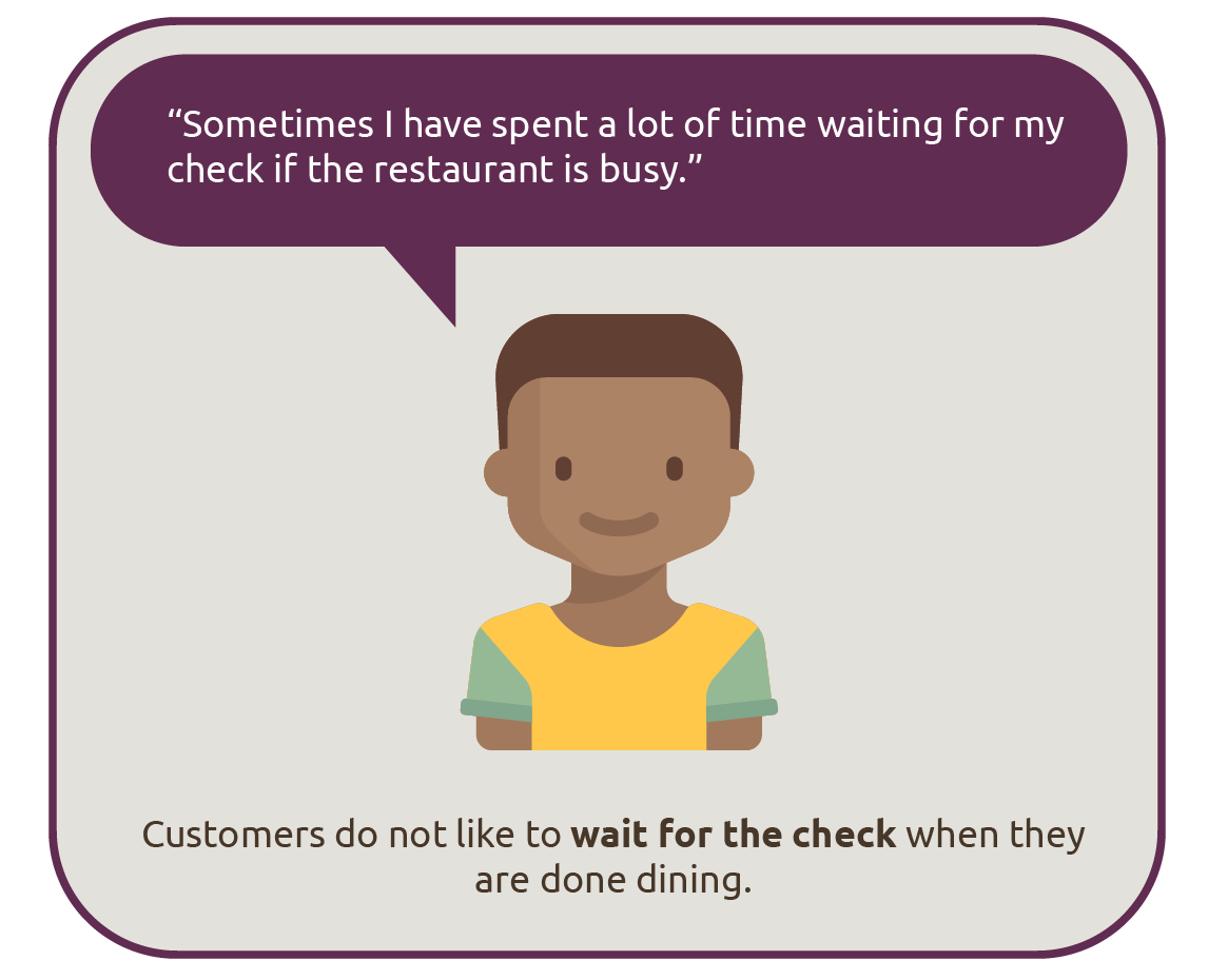
After our analysis, we extracted some key findings from our overall survey response data and user interview data. These were as follows -
Competitive Analysis
For the next phase, we moved on to Competitive Analysis, where we looked at some of the apps that already existed in the market, which we could learn from. We looked at the following -
Competitive Analysis across 4 apps
We analyzed these 4 apps across 6 dimensions - Navigation, Ordering, Splitting, Payments, Interactions, Content, and rated each of them on these criteria on a scale of 1 to 5 (5 being very good and 1 being very poor). This helped us figure out what features of what apps should we gain inspiration from and what mistakes to avoid. The dimension-wise rating matrix can be seen below -
Competitive Analysis: Dimension-wise rating matrix
Ideation & Brainstorming
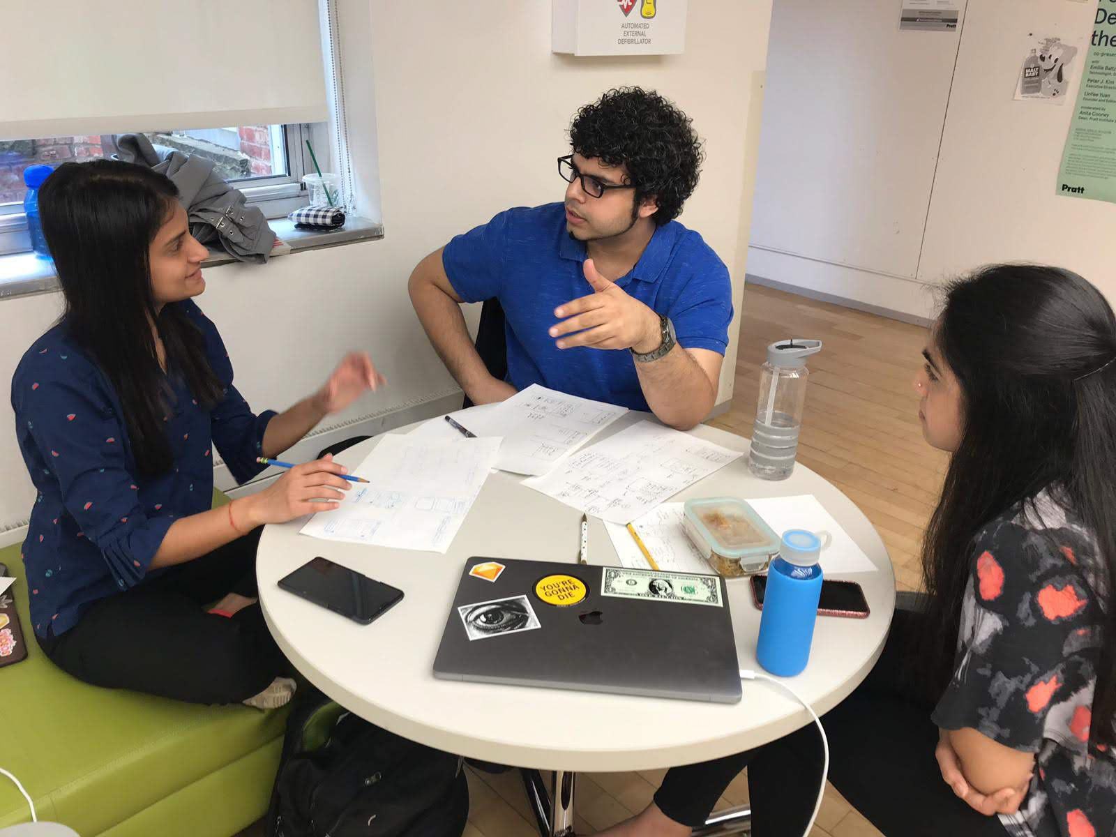
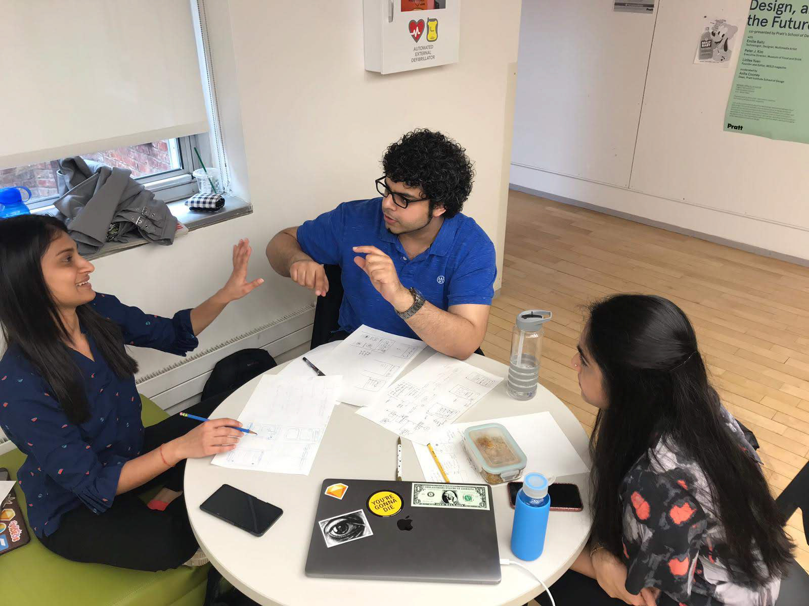
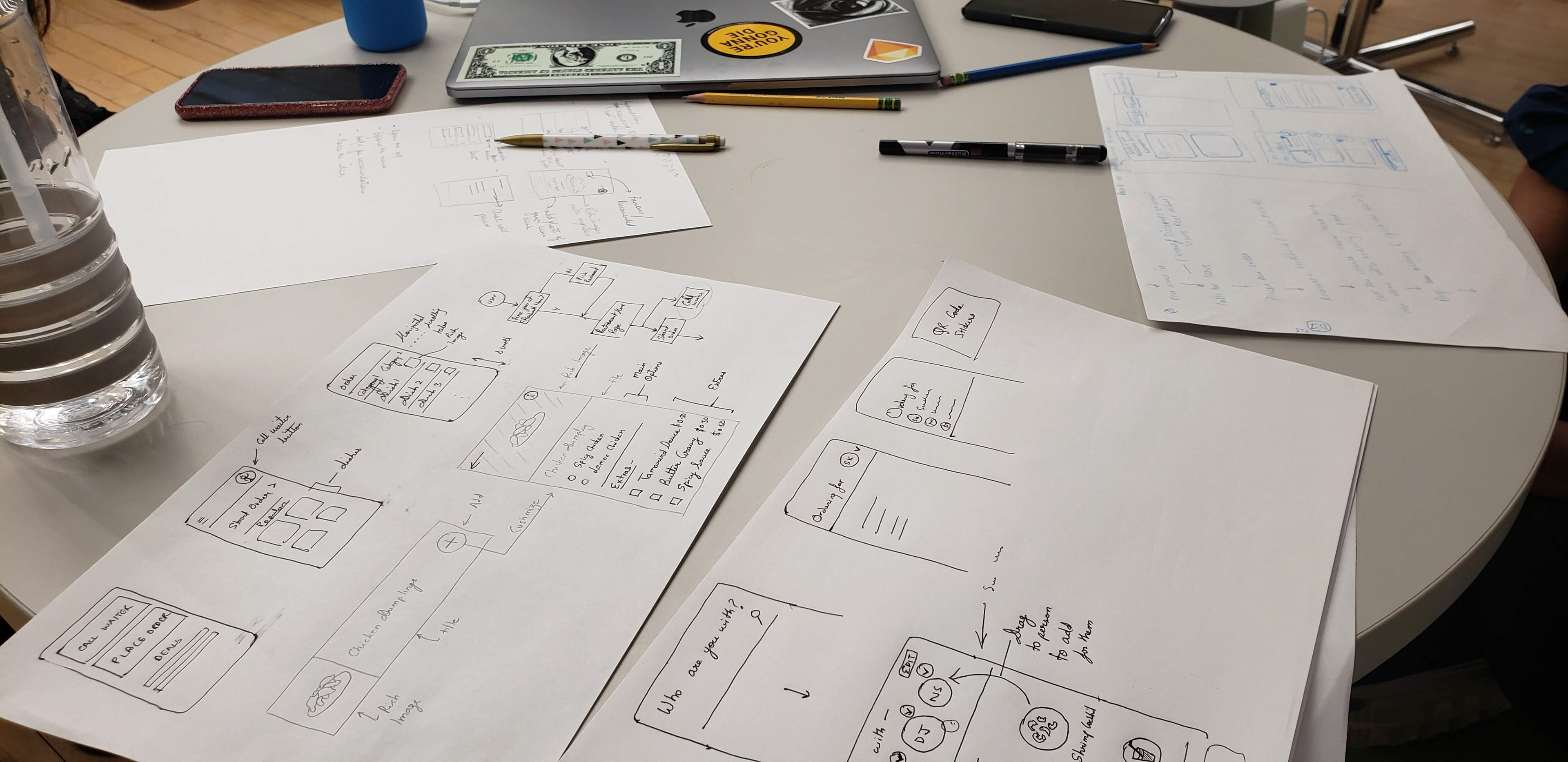
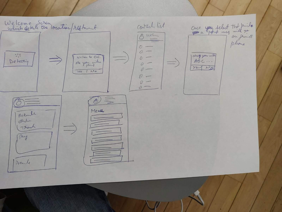
After learning from our competition on what to gain inspiration from and what mistakes to avoid, we conducted a team ideation and brainstorming session. In this session we all got together with pens and paper and individually sketched out as many ideas as possible in a 15 minute timeframe. Then each one of us talked about their ideas and discussed them with the team. This helped us come up with more ideas.
The Solution: A Mobile App
After our ideation and brainstorming session, we came to the conclusion that a mobile app would be most viable solution for the user pain points unearthed during our research phase. This is because -
1. Most people out of our target audience have their smartphones with them when they visit restaurants. Many have also used mobile apps for ordering food.
2. Good quality tablets are an expensive investment for restaurants, considering they need one for each table.
3. Tablets installed at tables will quickly be obsolete and would require an upgrade. There is also a chance for wear and tear due to so many people using it, especially in a setting where food and drinks are near the tablet at all times (Prone to spills or greasy hands etc.)
4. A single tablet at a table would need to be passed around if its not fixed or would require some guests to extend their reach to place their orders (unless they ask a friend who is closer to the fixed tablet to help them)
5. Kiosks aren't suitable for dine-in situations and are apt for takeout or fast food joints.
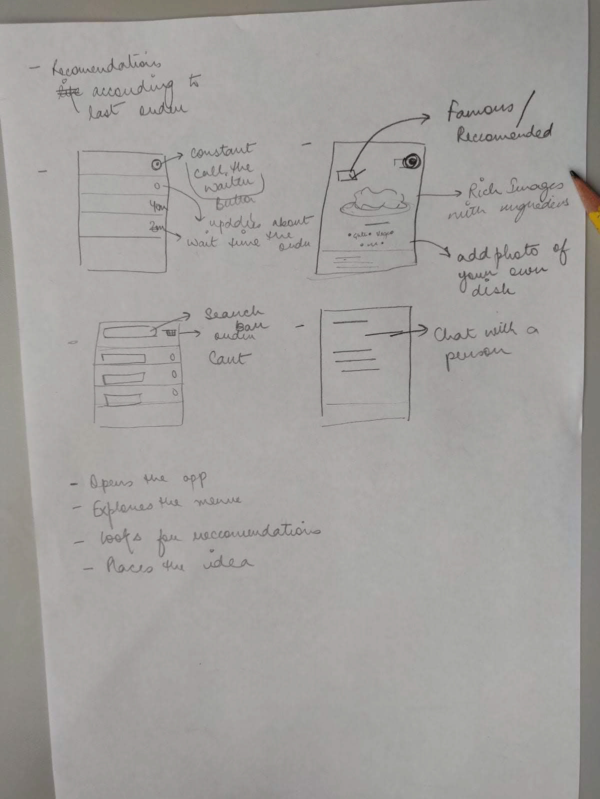
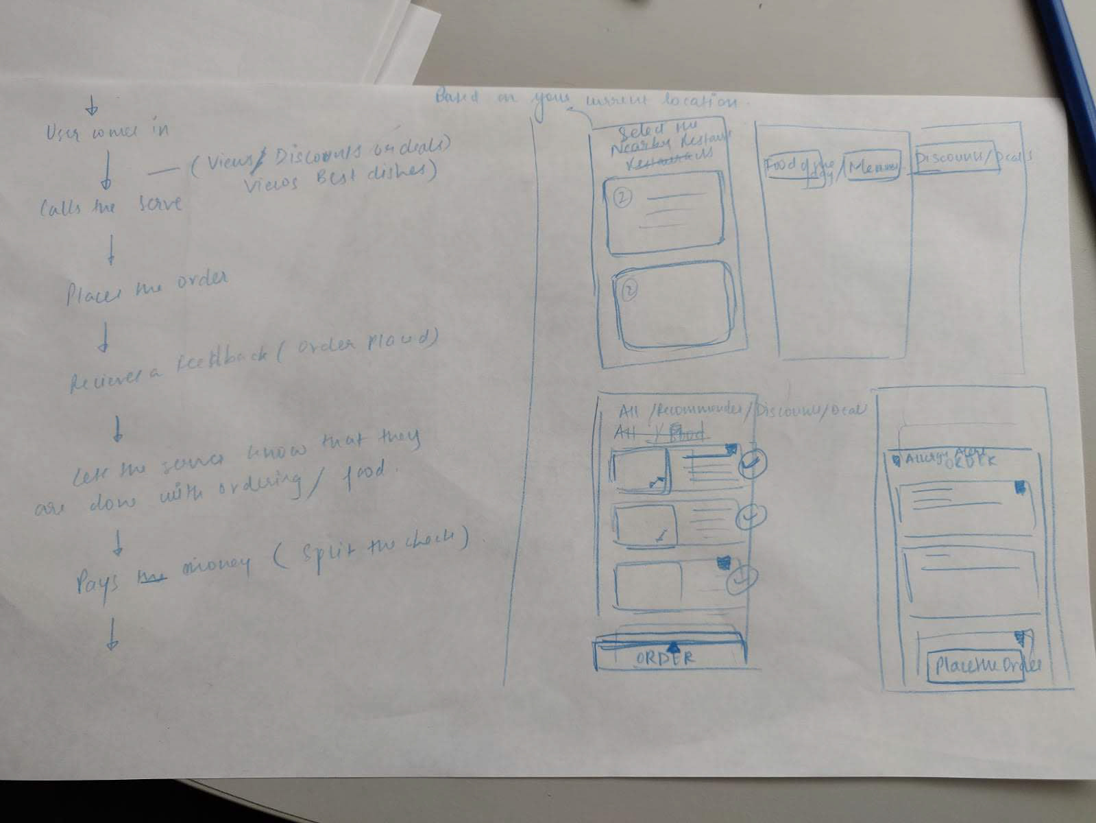
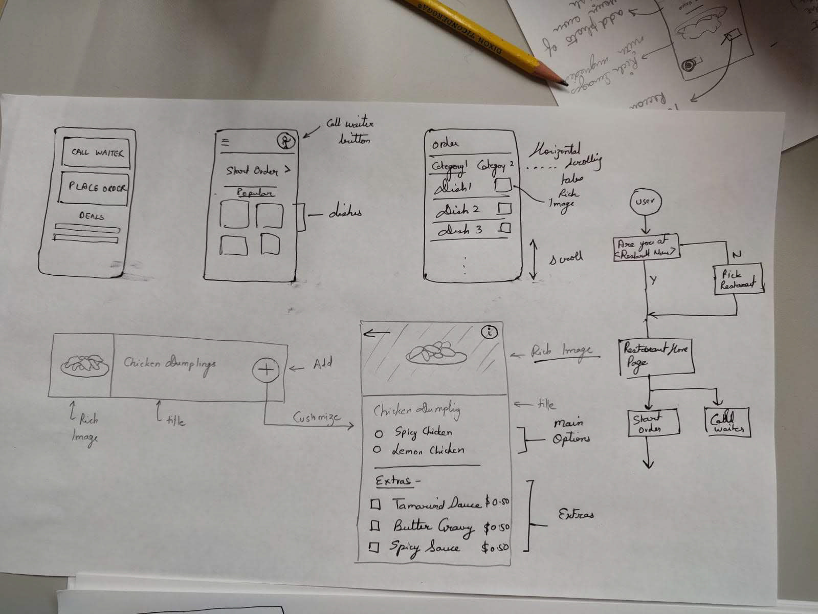
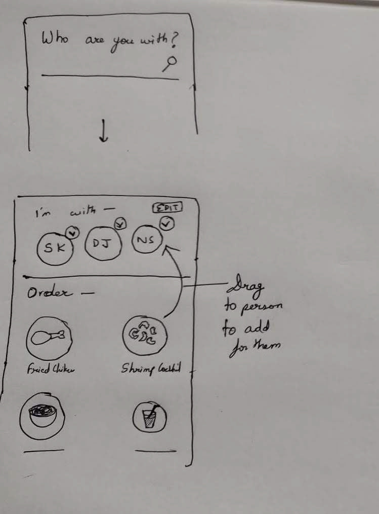
Wireframing & Prototyping
Our next steps were to create wireframes while keeping in mind what all we had learned from the user research, competitive analysis and ideation sessions and then linking them together to formulate our first low fidelity prototype.
User Stories
We started off by defining some user stories. We as a team came up with 12 user stories, which was a lot to take on given the project timeline, so we decided to prioritize the user stories that were most important based on our user research -
Prioritized User Stories:
1. As a user, I would like to be able to place an order at the restaurant of my choice.
2. As a user, I would like to be able to call the waiter if I need help
3. As a user, I would like to have recommendations from the restaurant to help me make my decision
4. As a user, I would like to see rich images of the dishes to help me make a decision.
5. As a user, I would like to be able to see what’s currently popular amongst customers.
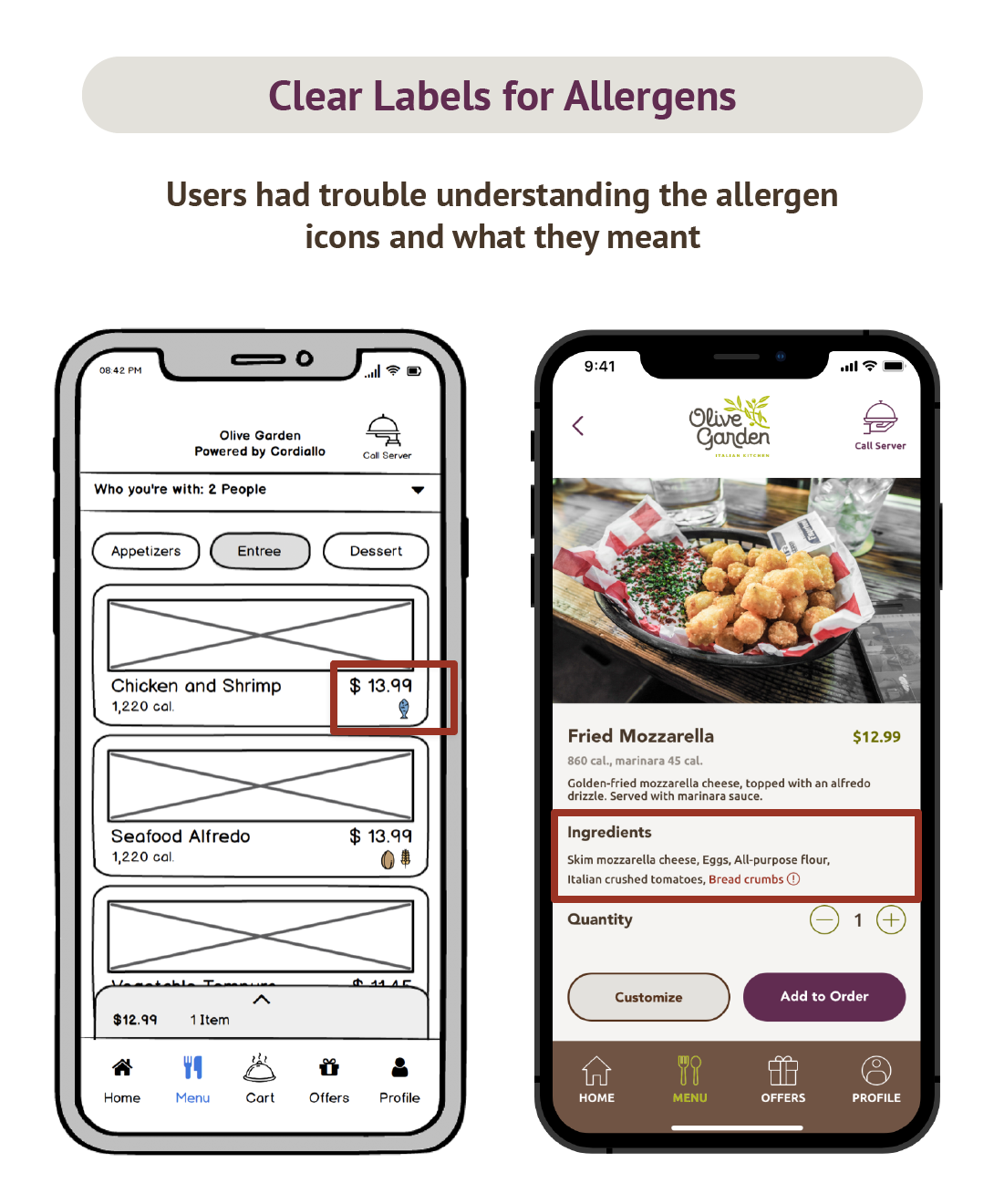
6. As a user, I need to have a clear indication of what all allergens are present in the dishes.
7. As a user, I would like to pay my check via mobile phone.
8. As a user, I would like to see if the restaurant has any deals and discounts for me.9. As a user, I would like to be able to customize my dishes based on what the restaurant offers.
10. As a user, I would like to be able to split my check based on my preferences.
Deprioritized User Stories:
11. As a user, I would like to track the order I have placed and check whether the server has taken the correct order or not. - We didn't hear much about tracking orders from our research, so we therefore deprioritized this
12. As a user, I would need to be able to cancel my order before the preparation has started. - We didn't hear much about cancelling orders from our research, so we therefore deprioritized thisLow-Fidelity Prototype
Based on the defined user stories we came up with the following low-fidelity prototype, which we created on Balsamiq mockups. We also leveraged the linking/prototyping feature of Balsamiq to link various screens together to form a flow. Some of the screens were as follows -
Low-Fidelity Screens
User Testing
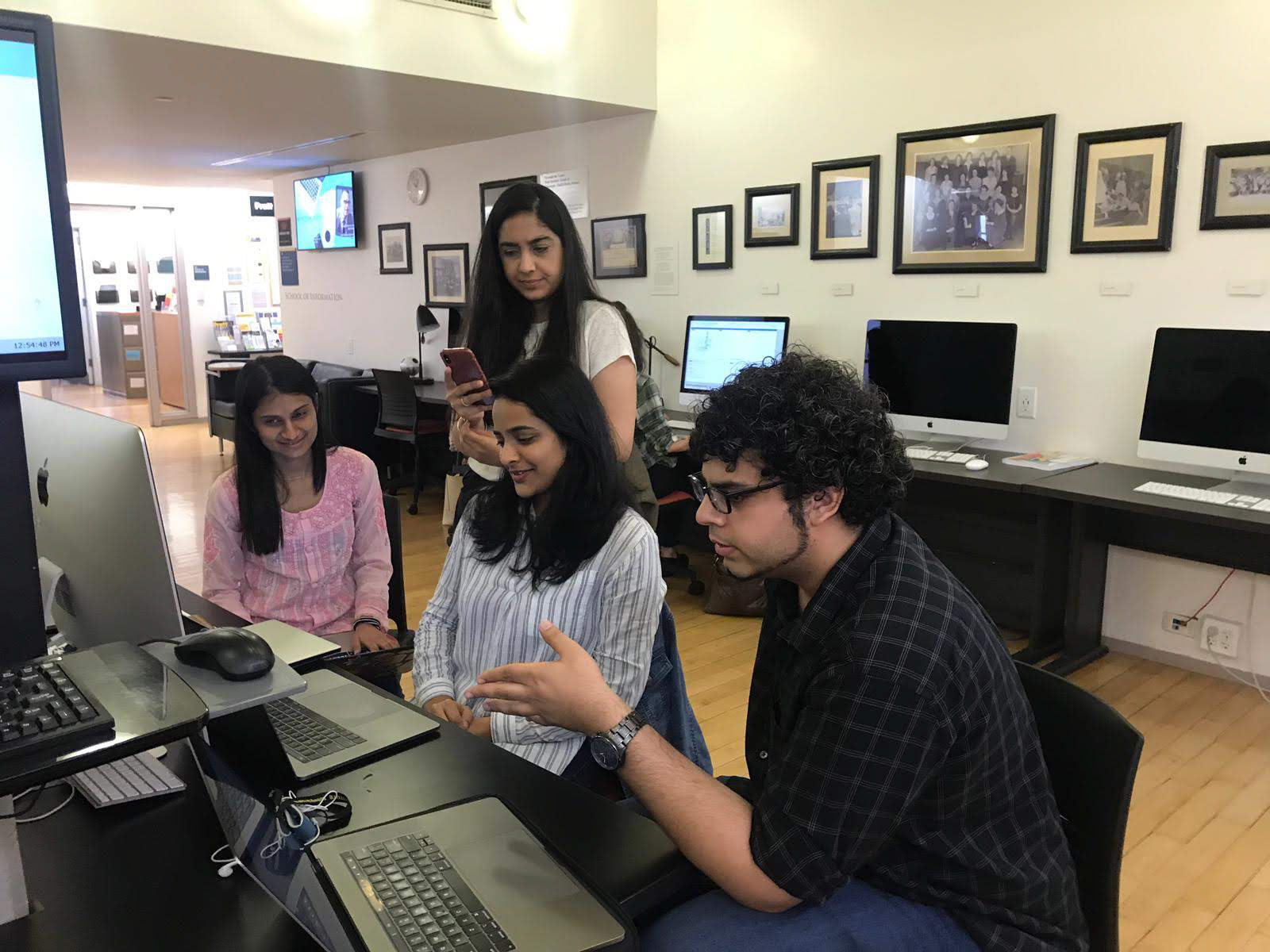
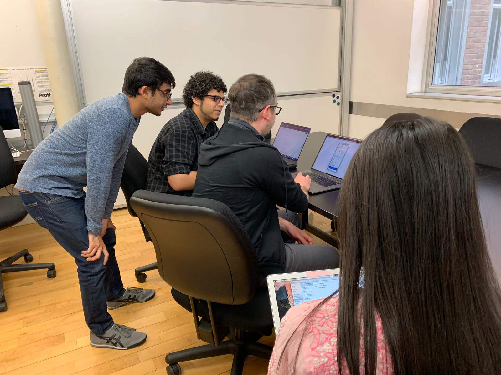
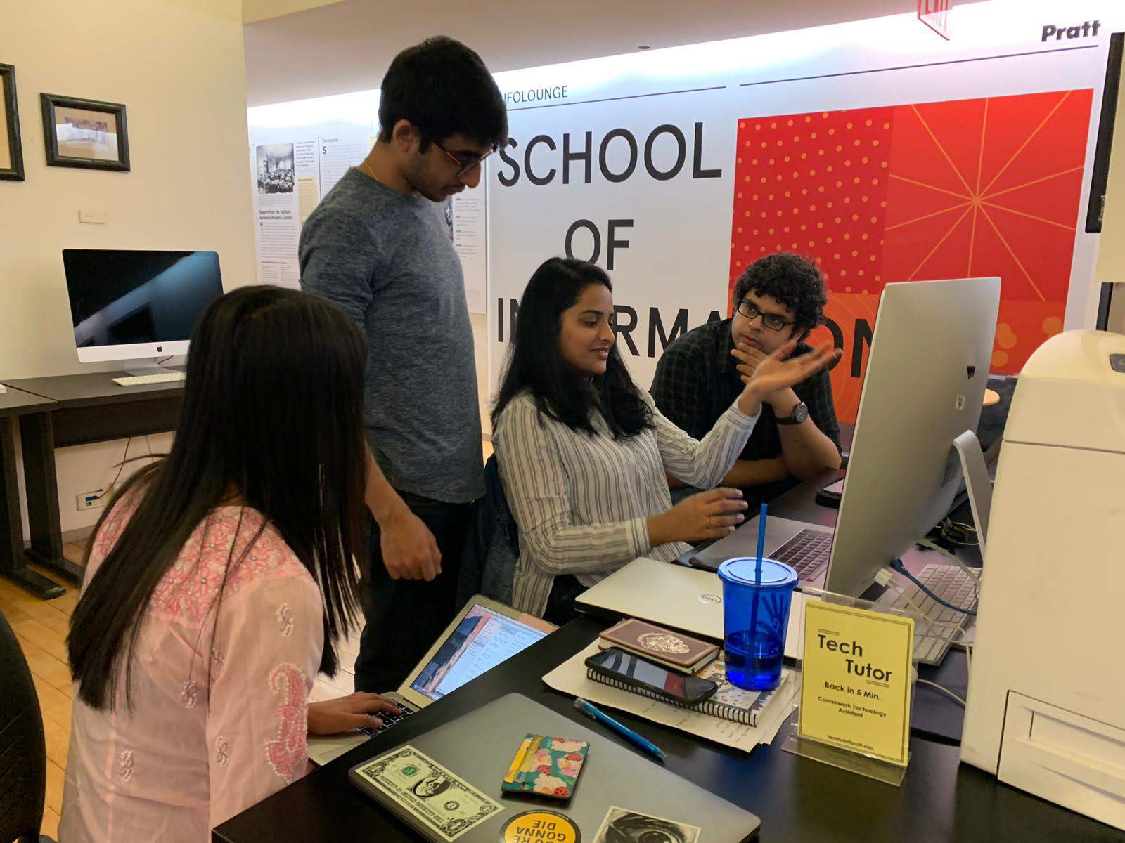
Since we wanted to validate and iterate on our designs, our next step was to test our low-fidelity prototype with users that fit our target audience. We created a user testing protocol, in which we had laid out 5 tasks for the users to perform. These user test sessions were to be in-person and we were following the think out loud protocol where the user was asked to speak out their thoughts while performing tasks on the interface. We recruited 5 users for this phase -
Our User Testing Approach
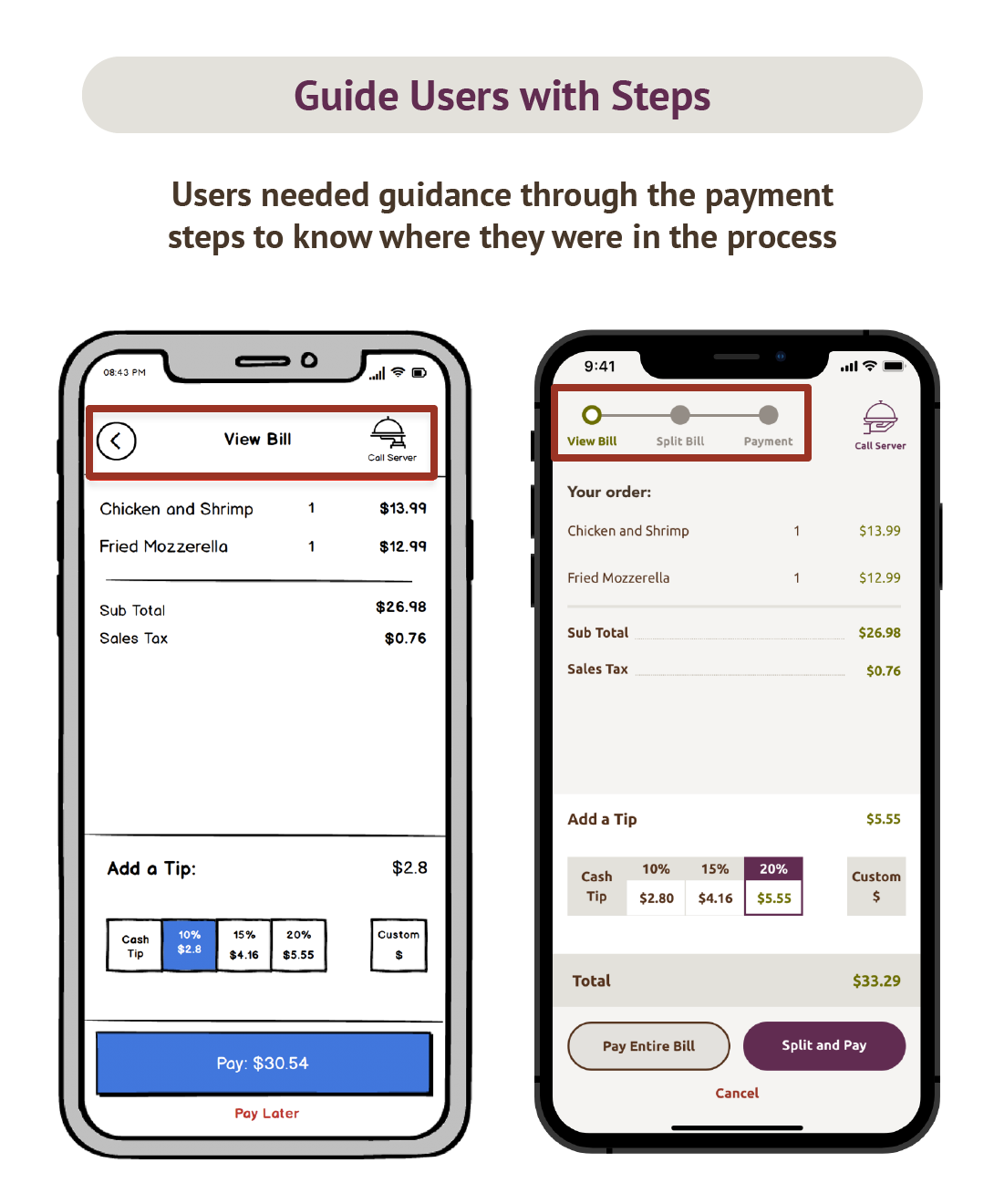
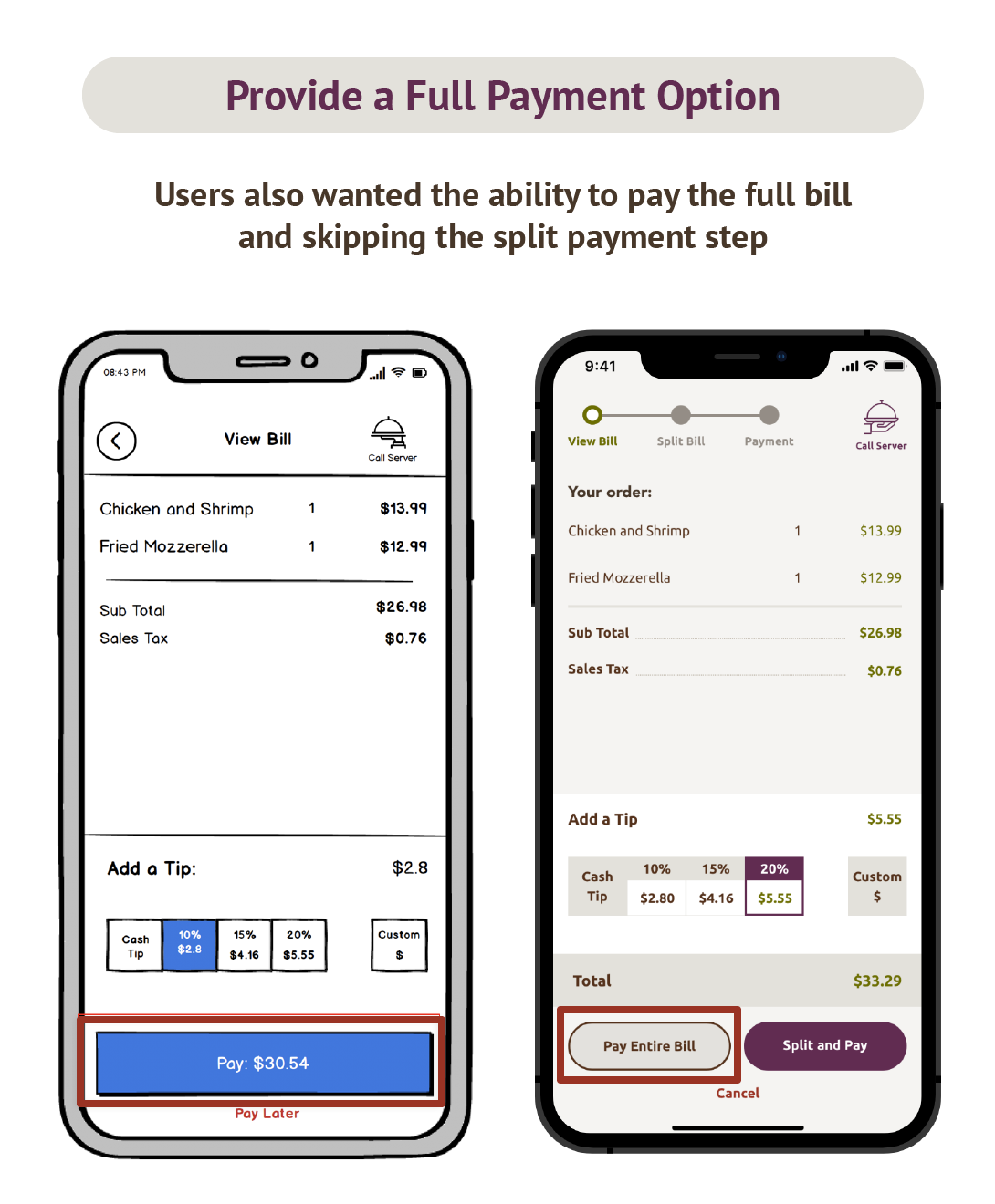
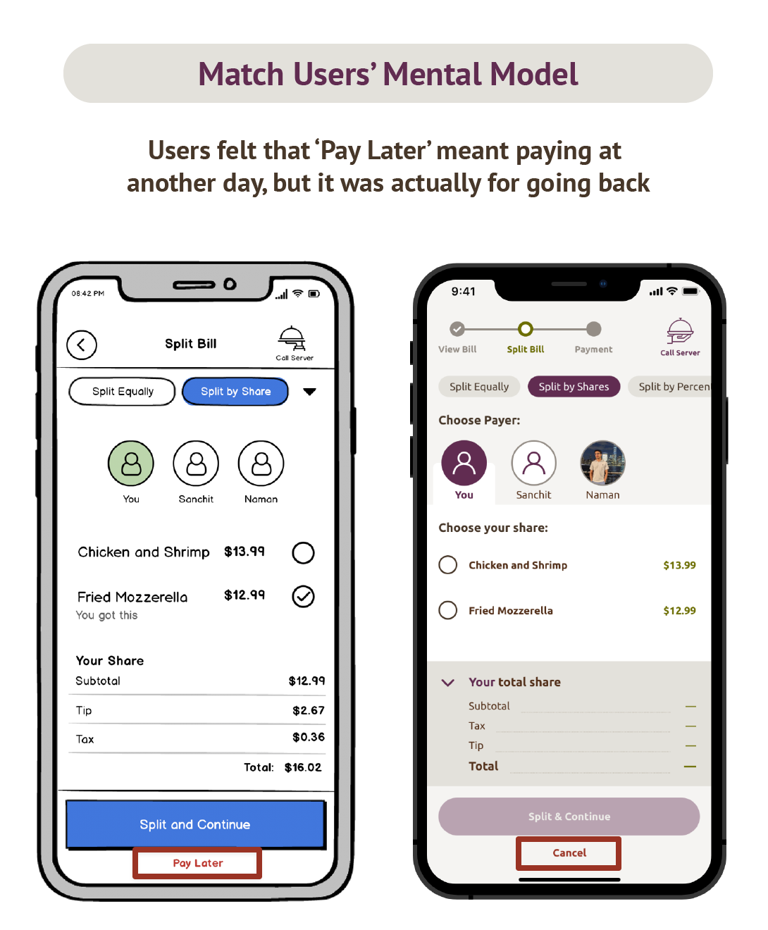
User Testing Key Findings
Users really liked our concept, which was very encouraging and the tests were especially very helpful as we were able to uncover some areas where the interface needed improvement to better match our users' expectations. The key findings were as follows -
High Fidelity Prototype
Based on what we had learned in the user testing, we made alterations to the low-fidelity screens and moved on to the high-fidelity phase. In this we were going to add a visual layer to our wires and bring the product to life.Since our app was supposed to be pluggable into any restaurant's experience, we thought about having a neutral interface for the flow before the user selects the restaurant they're at would make more sense. We therefore picked neutral colors for that section.
Style Guide: Olive Garden
Next, we decided to show the interface in one particular restaurant's theme as an example, and our choice was 'Olive Garden' since it was a restaurant that was using tablets for ordering, which we had experienced.
Our Visual Style Guide
High-Fidelity Screens
Based on the defined style guide, we came up with the following high-fidelity screens -
Our High Fidelity Screens
High-Fidelity Prototype in Action
We created our animated high-fidelity prototype using Adobe XD.
I also created a background and phone frame using HTML and CSS on CodePen to embed the prototype, which can be seen below (Click 'Run Pen' to start) -
App Walkthrough
To explain how the app would work in a group ordering scenario, here's a little story of three friends - Tim, Sanchit and Naman who want to eat Italian food on a Friday evening:
Entering the restaurant with a group and getting settled
Tim, an IT professional enters Olive Garden restaurant with two friends - Sanchit and Naman. A restaurant staff member assists the party of 3 to a table. The table has a QR code on it.
Once seated, Tim whips out his smartphone and launches the Cardiallo app and scans the QR code at the table. The Cordiallo app gets to know that Tim is at Olive Garden, sitting at Table 10!
Cordiallo then prompts Tim to enter who he’s with, so that the app can also be used by Sanchit and Naman. Tim selects Sanchit and Naman and then taps on ‘Confirm’. Now Cordiallo knows who Tim is with and sends a notification to Sanchit and Naman’s phones saying 'Tim has added them to a table'.
Entering a restaurant and getting settled
Ordering an Item on one phone
Tim is now on the home screen and looking at various offers at the restaurant. Since no offer appeals to him at the moment, he taps on ‘Menu’ to start ordering.
Simultaneously, Sanchit and Naman can also now open their Cordiallo apps on their devices. Now since Tim had initially added Naman and Sanchit to the table, they now have access to a common ordering cart!
Tim, Naman and Sanchit wanted to share a fried Mozzarella, so Tim finds and adds the dish to cart.
Ordering the first item on one person's phone
Ordering another item on another phone
Now over to Sanchit’s phone. Naman and Sanchit being the only non-vegetarians at the table, decide to share a “Chicken and Shrimp”, which Sanchit adds to the cart on his phone.
As the order is being built by multiple people, each one sees an up to date cart in real time! Now Sanchit swipes up the cart and hits ‘place order’, and a success message provides feedback to let him know that its in the works.
Ordering another item on another person's phone
Splitting and paying the bill
An hour later, Tim, Sanchit and Naman are done eating and would like to go home. Tim pulls out Cordiallo and swipes up his cart and hits ‘Generate Bill’. The bill is almost instantaneously generated and Tim can see the totals. They all decide to leave a 20% tip as they loved the experience at the restaurant.
Now that it’s time to pay the bill, ’Shall we go dutch?’ asks Naman, but Sanchit says that it won’t be fair to Tim, as he only had a share of the ‘Fried Mozzarella’. They all agree and Tim taps on ‘Split and Pay’ and also chooses the ‘Split by Shares’ method up top, so that each person can pay for their own share.
Tim now selects the dish ‘Fried Mozzarella’ for himself, switches to Sanchit and adds both ‘fried mozzarella’ and ‘Chicken and Shrimp’ since he had both, and repeats the same for Naman as well. The totals for each are now up to date, which Tim double checks by tapping each person’s tab. Once fully satisfied, Tim hits ‘Split and Continue’ and the app shows a wait animation.
Immediately, Sanchit and Naman’s phones receive a notification to accept the charges Tim just entered. Sanchit and Naman click accept on their devices, and the app shows check marks as soon as each one of them accepts. As soon as this is done, the payment is completed with respective amounts deducted from each person. Tim and his friends can now go home, all well fed and watered!
Splitting and Paying the bill
Reflection
This project was a great learning experience for me as I was pushed to think of how a smaller screen size and a different context of usage affects the interface and user journey. I also learned that it is very important to prioritize features for your MVP, by carefully thinking about the timeline. User research data can be leveraged to think about the features that would be most useful for the target audience and hence help shape a product that people would really like to buy. Finally, since we had combined 3 complex flows of ordering, splitting bills and payment, I learned the importance of making each process very clear and concise in order to keep users focussed on the task at hand.
--- THANK YOU! ---
