
ABOUT THE PROJECT
Port Authority of New York and New Jersey (PANYNJ) is the body responsible for most of the transportation infrastructure within the Port of New York and New Jersey.
To evaluate the usability of the PANYNJ website from a novice user’s perspective, our four-member team of usability experts, logically selected the Cognitive Walkthrough approach and conducted an in-depth, step-by-step inspection of the website. The target users for our study were senior citizens, visiting the website for the first time.
On completion of the study, our inspection unearthed several usability issues, that prevent the PANYNJ website from unleashing its true potential. I carried out a thorough analysis of the unveiled issues, and came up with solutions.
Disciplines
Cognitive Walkthrough, User Experience Design (UI/UX), Prototyping, Usability
Our Team
Sanchit Kumar (Project Lead, Primary Evaluator)
Heather Hill (Secondary Evaluator)
Caitlin Ballingall (Secondary Evaluator)
Wenjun Dai (Secondary Evaluator)
My Role
Defined scope and tasks for best possible coverage of important segments of the website.
Organized and led the Cognitive Walkthrough sessions with secondary evaluators.
Gathered and analyzed all findings (Own results + Secondary evaluators' results)
Came up with solutions to key issues and created mockups to support them
Designing and creating the final report
Final Deliverable
The following final deliverable was submitted -
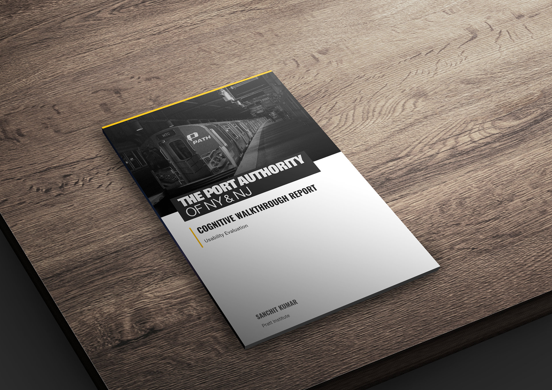
Full Cognitive Walkthrough Report


METHODOLOGY
The PANYNJ website was evaluated by a team of four usability experts, under my leadership.
The following methodology was used:
Our Methodology
Target Users
The target users selected for our study were novice senior citizens, of the age of 65 and above

Task and Action Sequence
The task selected for our study was: ‘Use the PANYNJ website to apply for a PATH Senior SmartLink Card’.
The following sequence of five actions was defined to complete the task:
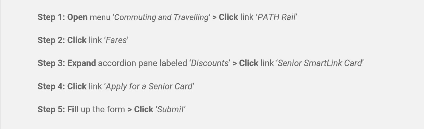
Cognitive Walkthrough Action Sequence
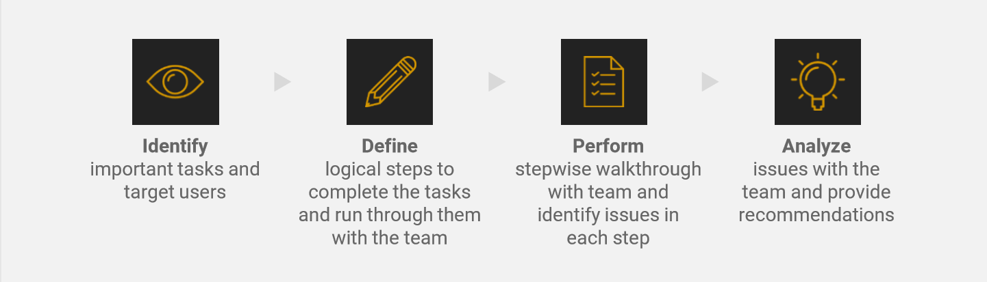
The Procedure
Once the task and action sequence were defined, an initial walkthrough of all the steps was performed at first. Then, team members placed themselves in the mindset of the target user and performed an in-depth step-by-step analysis of the task. As defined by Wharton, et al. in 1994, there is a set of four vital questions that need to be asked at each and every step. These questions are as follows:
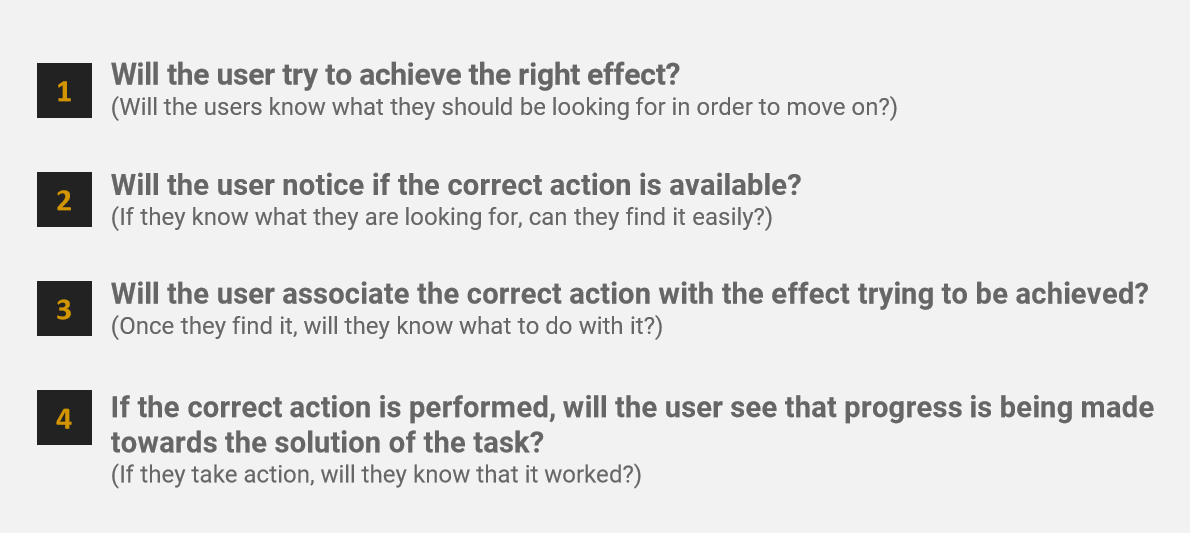
Cognitive Walkthrough - Four Questions for each step

KEY FINDINGS & RECOMMENDATIONS
I analyzed the findings obtained from the Cognitive Walkthrough session and came up with the following recommendations to mend the most crucial problems:
Recommendation #1: Improve discoverability of the primary navigation and remove confusing elements and clutter
The Problem
Usability issues were found with the primary navigation:
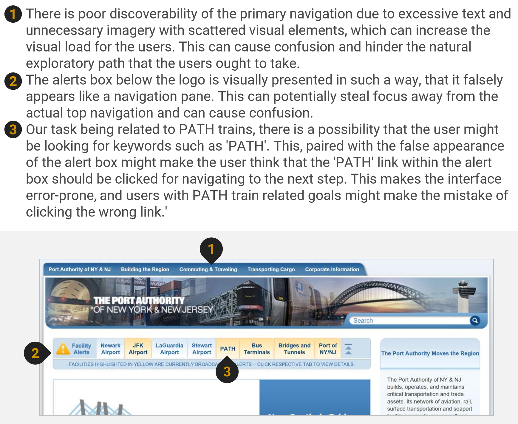
Problems found: Primary Navigation
The Recommendation
I came up with the following recommendation:
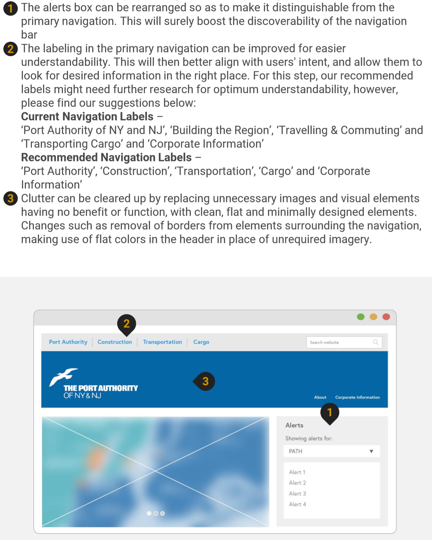
Recommendation #1: Improve discoverability of the primary navigation and remove confusing elements and clutter
Recommendation #2: Perform chunking of large data and improve discoverability of discounted senior metro card
The Problem
The discounts accordion pane had a few usability issues:
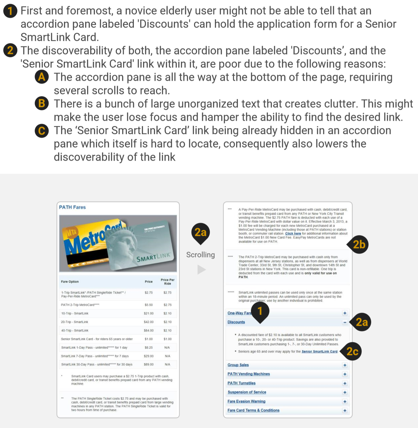
Problems found: Discounts Accordion Pane
The Recommendation
I recommended the following -
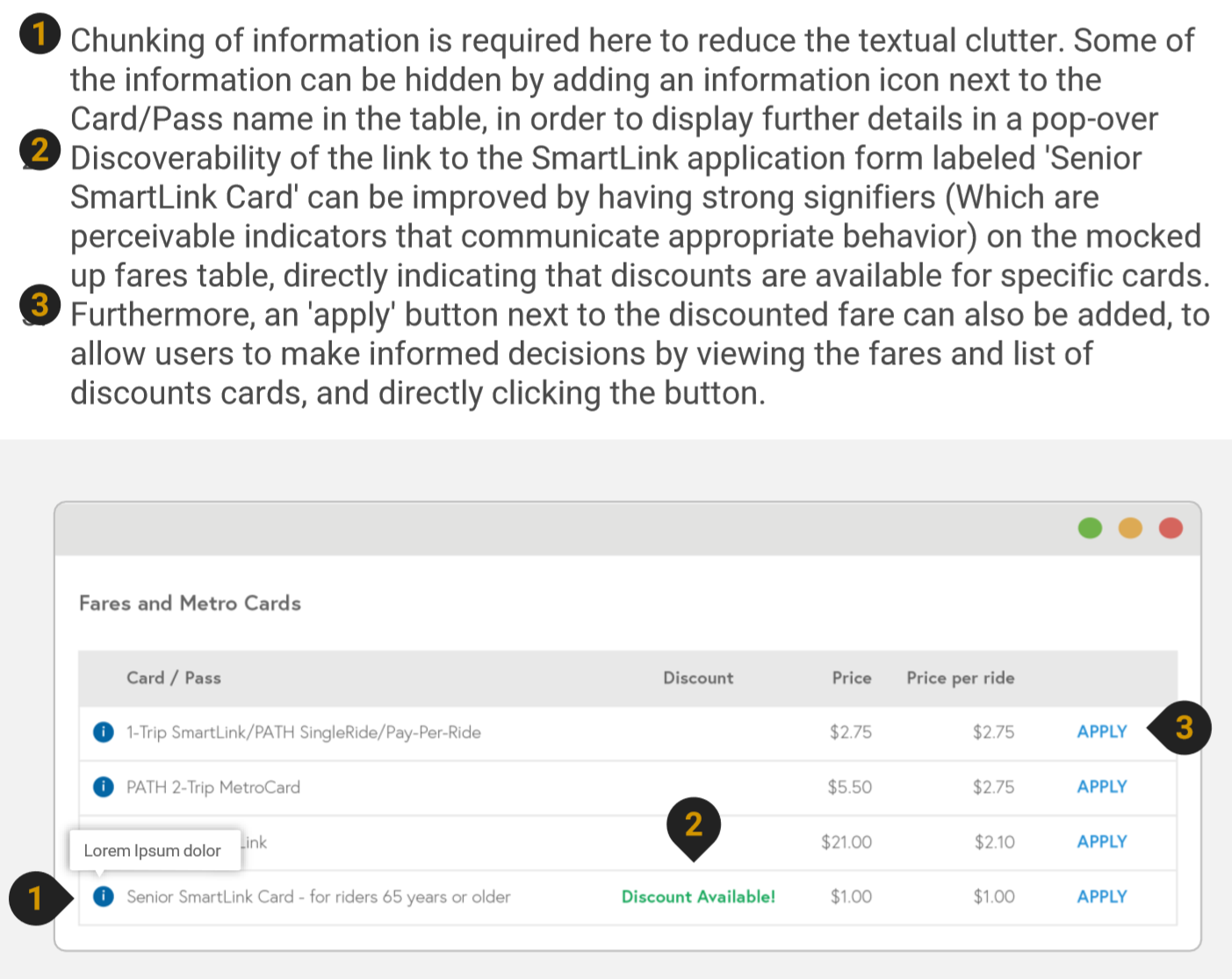
Recommendation #2: Perform chunking of large data and improve discoverability of discounted senior metro card
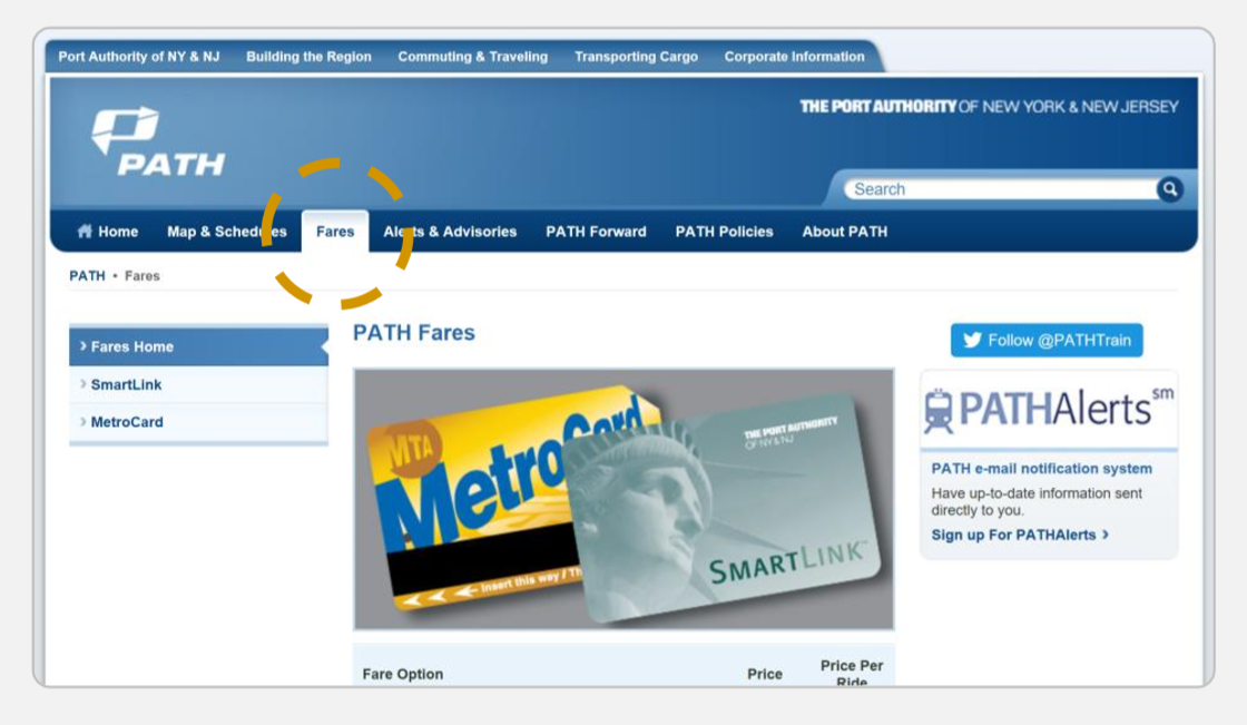
Recommendation #3: Improve labeling of the navigational item: ‘Fares’ to make it more understandable for users
The Problem
The link in the secondary navigation labeled ‘Fares’ (Shown below) is not where the novice user would expect to find the application form for the discounted metro card. Users might be looking for keywords such as ‘Pass’ or ‘Metro Card’ to look for a way to lead them to the application form.
Problem Found: Confusing Labels
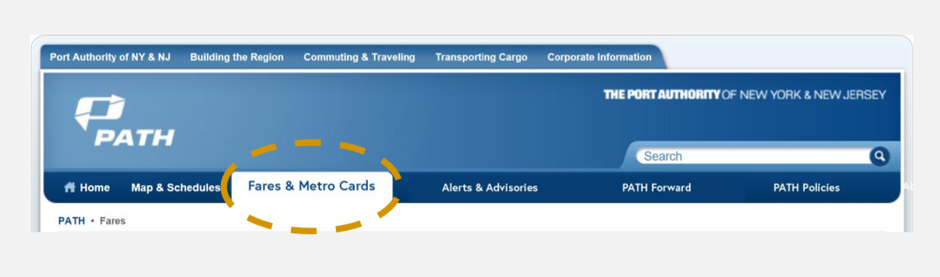
Our Recommendation
To tackle the uncovered usability issues, the following change to the label of the secondary navigation link needs to be made (Shown below): Original label: ‘Fares’ New Label: ‘Fares & Metro Passes’
Based on my analysis, the recommended label will align better with users’ goals, and the novice target users should be able to figure out where to click to proceed.
Recommendation #3: Improve labeling of the navigational item: ‘Fares’ to make it more understandable for users

CONCLUSION
The Cognitive Walkthrough is a quick and cost-effective way of evaluating the usability of an interface. The process does lead to considerable usability improvements due to the four logical questions asked at each step. However, it is important to note that Cognitive Walkthrough is a discount method of usability evaluation, and substitutes expertise instead of actual user feedback. Involving users in the process is the most effective and powerful usability test process, but tends to be more costly. However, the results are accurate, and therefore, worth the time, money and effort.
--- THANK YOU! ---