ABOUT THE PROJECT
This project was a part of the Information Architecture and Interaction Design course at Pratt Institute.
Sesame Workshop is an American non-profit organization that has produced several children's programs for educational purposes, including the very well known 'Sesame Street'.
This goal of this project was to redesign the Sesame Workshop website with a focus on the information architecture improvements as well as the mobile channel experience design.
Our Disciplines
User Experience Design (UI/UX), Information Architecture, Interaction Design, Prototyping, Usability Testing
Our Team
Sanchit Kumar (Entire Project)
Naman Sehgal (Entire Project)
Kara Bledsoe (Information Architecture Phase only)
My Role
End-to-end project delivery, User Research, Information Architecture, Competitive Analysis, Interaction Design, User Testing, Prototyping
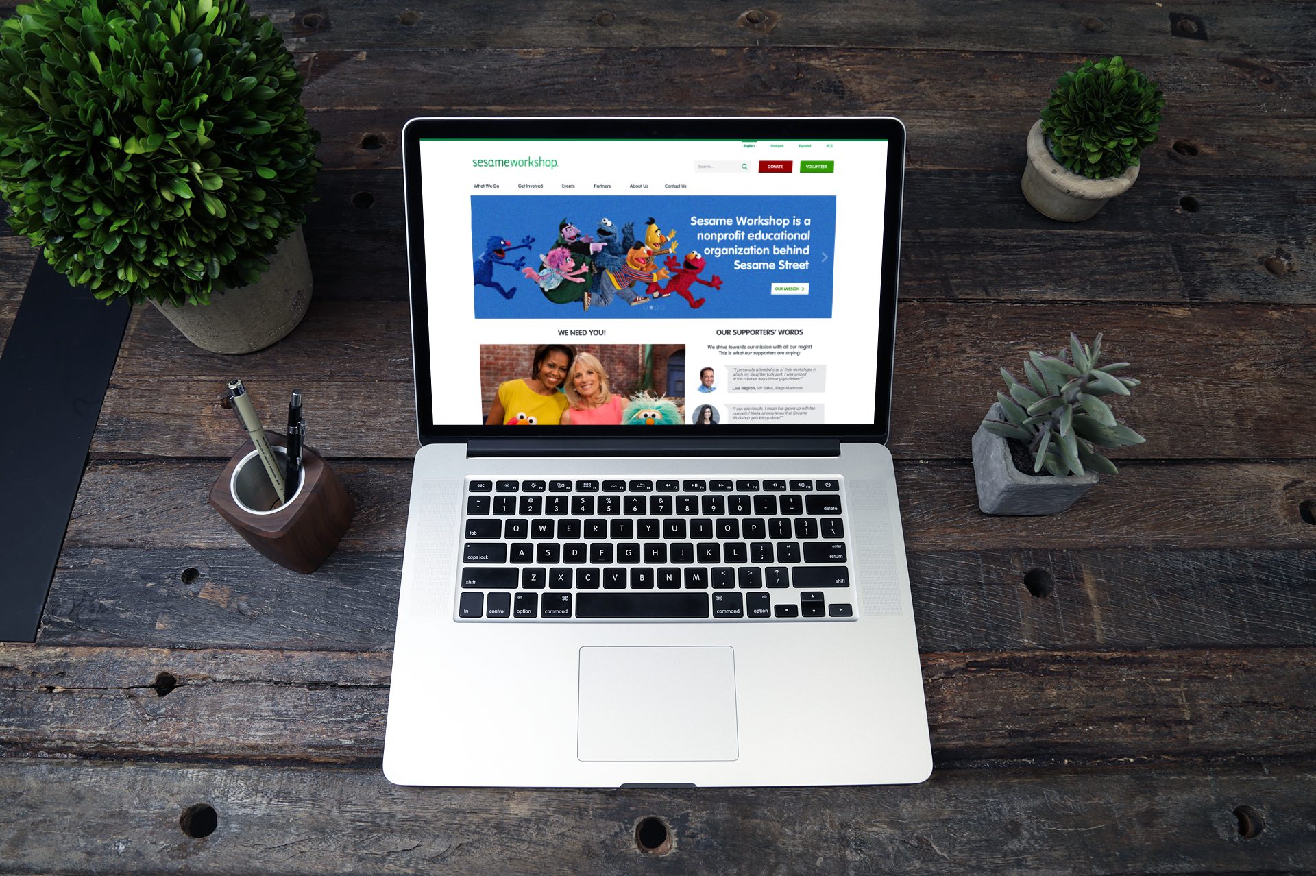
SESAME WORKSHOP'S CURRENT WEBSITE
Sesame Workshop's current website, though extremely informative and visually vibrant, is not without its flaws.
The website's information architecture requires re-work, along with the need for improvements in its interaction design.
Furthermore, the website is not mobile-optimized and therefore requires the conceptualization of a mobile variant.
Sesame Workshop's Current Website
THE DESIGN PROCESS
The following User Centered Design process was followed in our project:
The Design Process
STEP 1: USER RESEARCH
We kicked off our project with User Research, in order to gain a clear understanding of Sesame Workshop's users.
Each team member focused on one user group, and my area of focus was - 'employees of various NGOs and non-profit organizations, involved in outreach and PR roles'.
Research Techniques
I made use of the following research methods to understand users:
Research methods
Personas
Based on my gathered research data, I formulated the following Persona:
Persona formulated based on the user research results
Key Findings
I analyzed my research data and learned the following:
Key Findings after research data analysis
STEP 2: INFORMATION ARCHITECTURE
Since the purpose of the redesign was to improve the information architecture of the Sesame Workshop website, we conducted Card Sorting and Tree Testing studies to gain a better understanding of the target users' mental models to guide the creation of a revamped information architecture.
Card Sorting
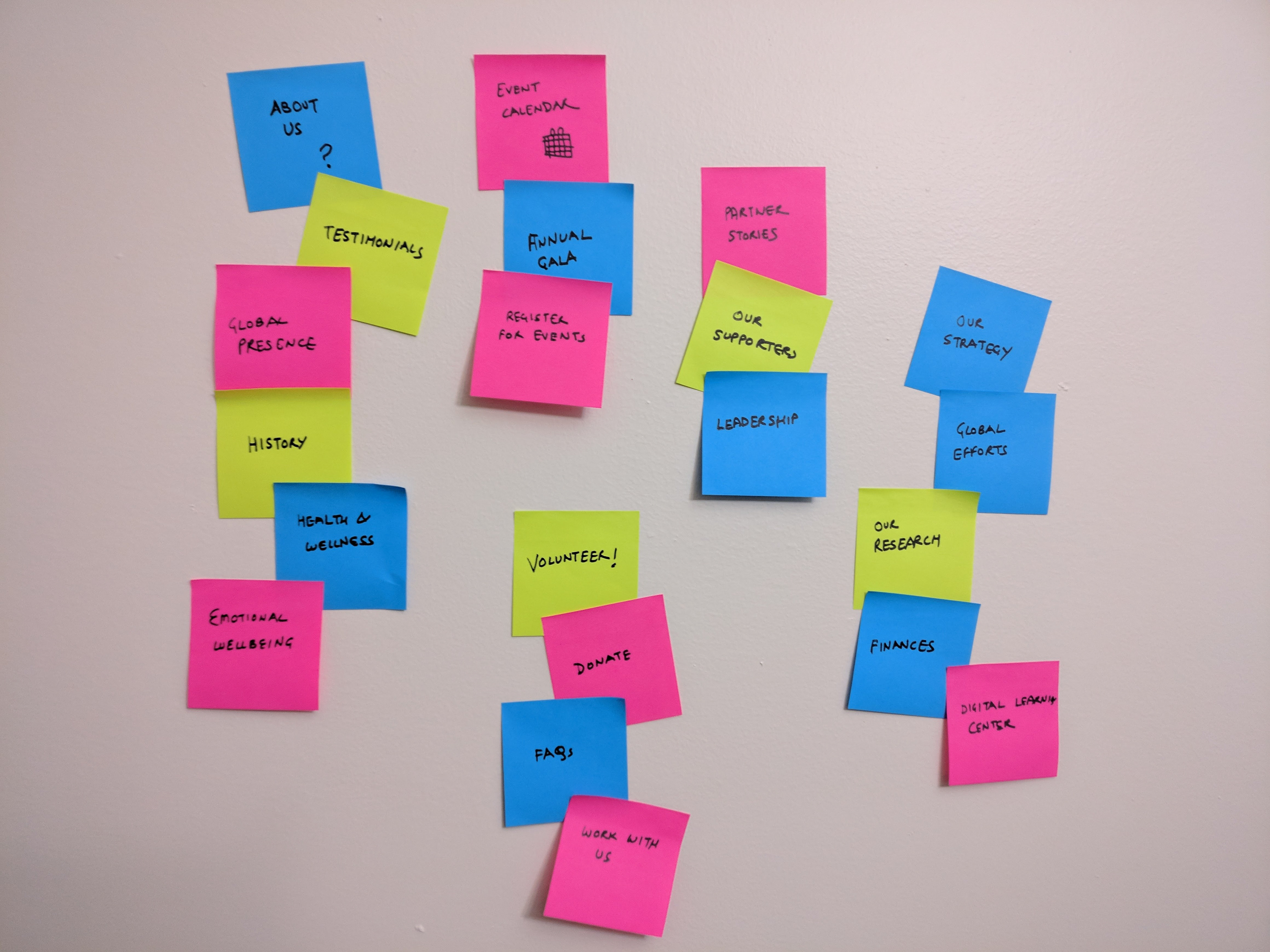
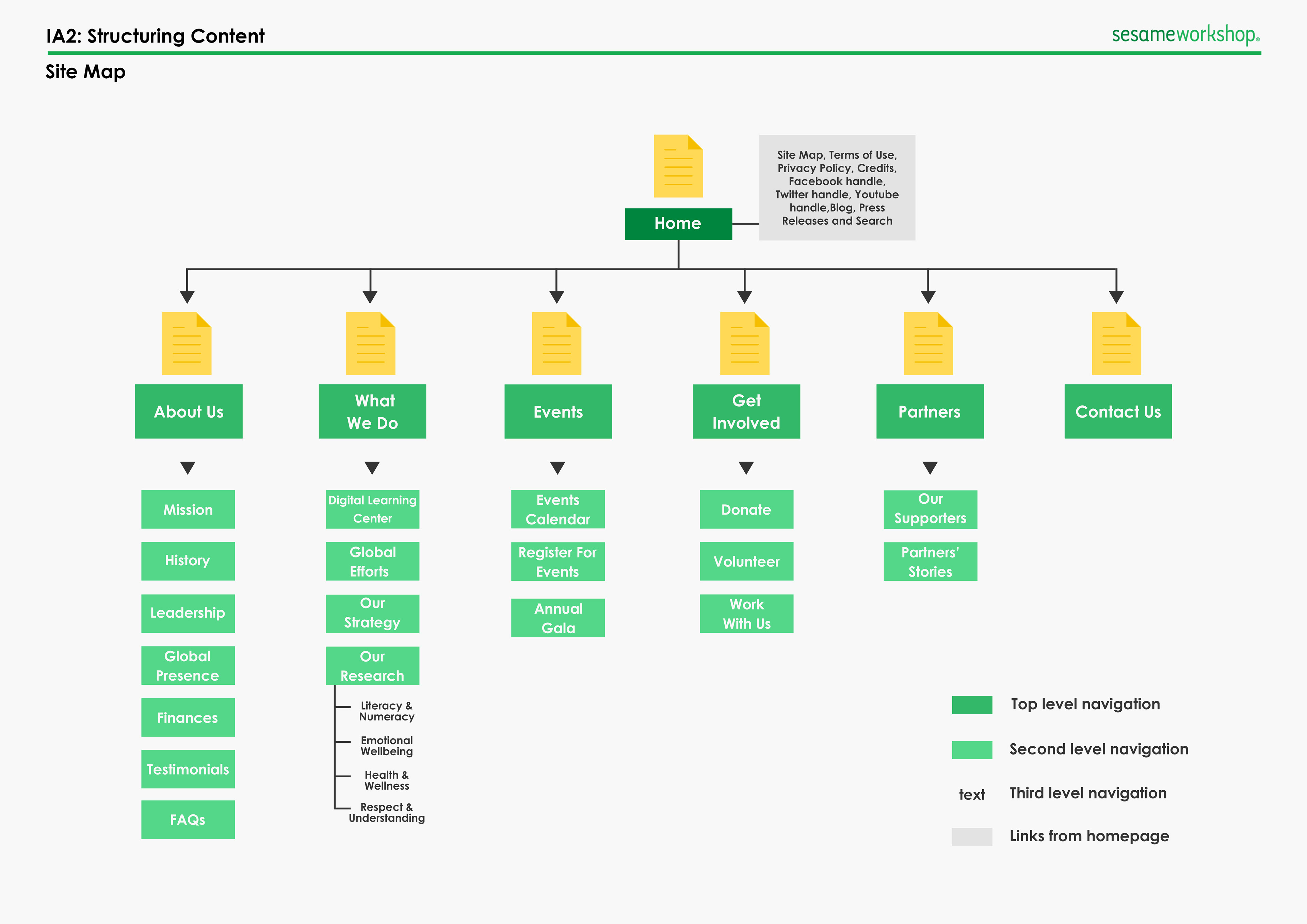
We created 31 cards to be sorted into categories by users and analyzed the results to formulate a draft information architecture in the form of a Site Map:
Our 31 Cards that were sorted by users
Analysis of the Card Sorting results
Tree Testing
We laid out 7 tasks to be performed on the draft Site Map in order to test and refine it to be able to formulate the final Site Map:
Our Tree Testing results for the 7 tasks that were laid out
Analysis of our Tree Testing results
Site Map
The Site Map was then finalized after analyzing the overall findings from the Card Sorting and Tree Testing studies using Affinity Mapping techniques and making necessary modifications to the draft Site Map:
STEP 3: COMPETITOR ANALYSIS
We then analyzed Sesame Workshop's competition to learn from their well-designed elements, as well as to try to avoid any poor design decisions that they were making.
Our study used five dimensions rated from 1 to 3 to evaluate performance on
each competitor site's homepage, structure, content, appearance, and mobile
experience. (3 being the highest rating, reflecting excellence in a particular dimension)
each competitor site's homepage, structure, content, appearance, and mobile
experience. (3 being the highest rating, reflecting excellence in a particular dimension)
Our Competitive Review - Dimension-wise rating for each competitor
Step 4: Interaction Design
This step in our process marked the transition from Information Architecture to Interaction Design.
Brainstorming
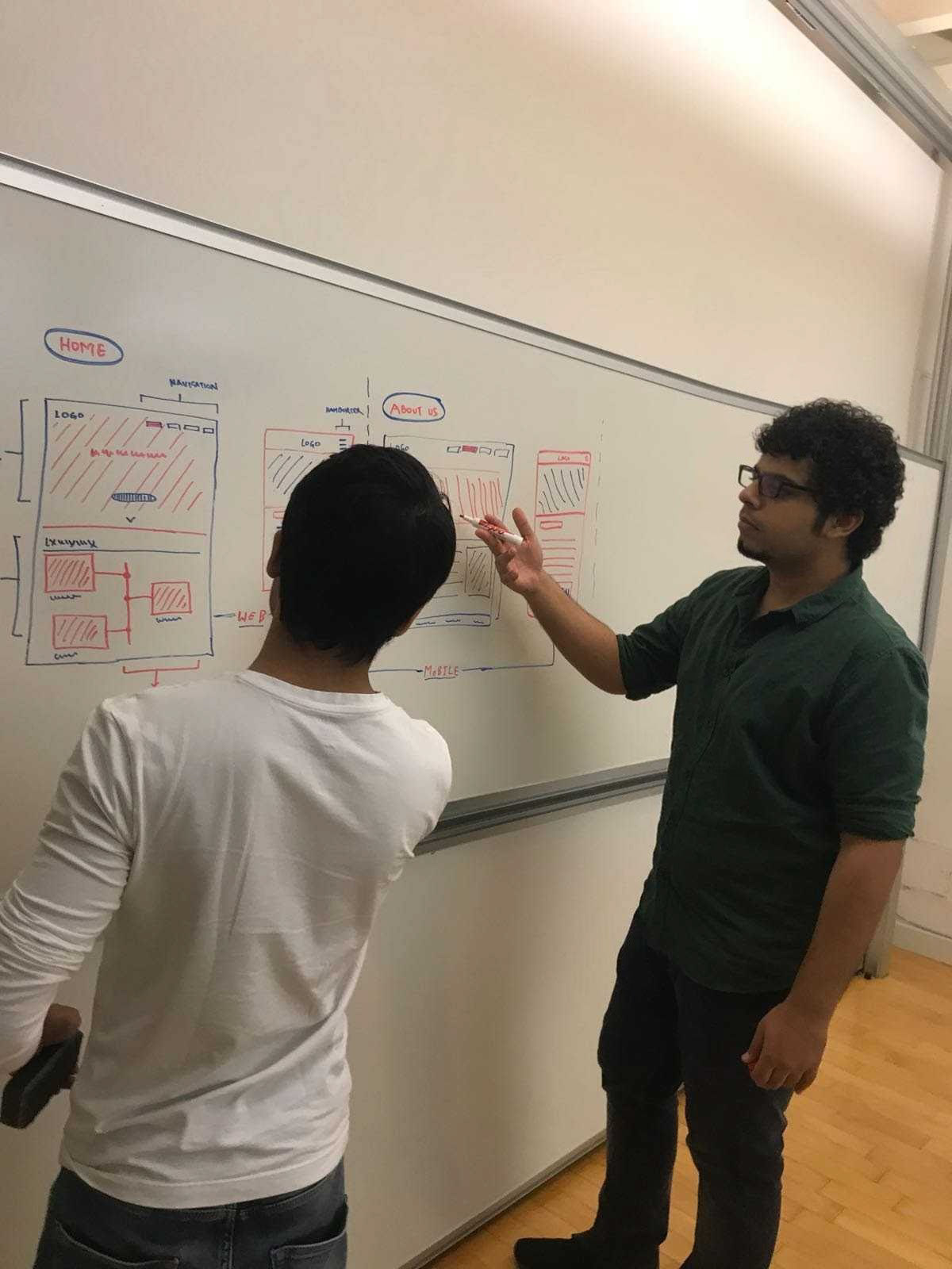
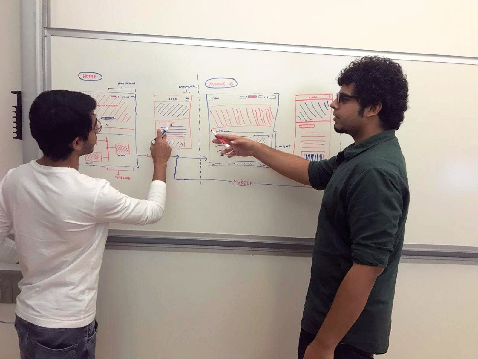
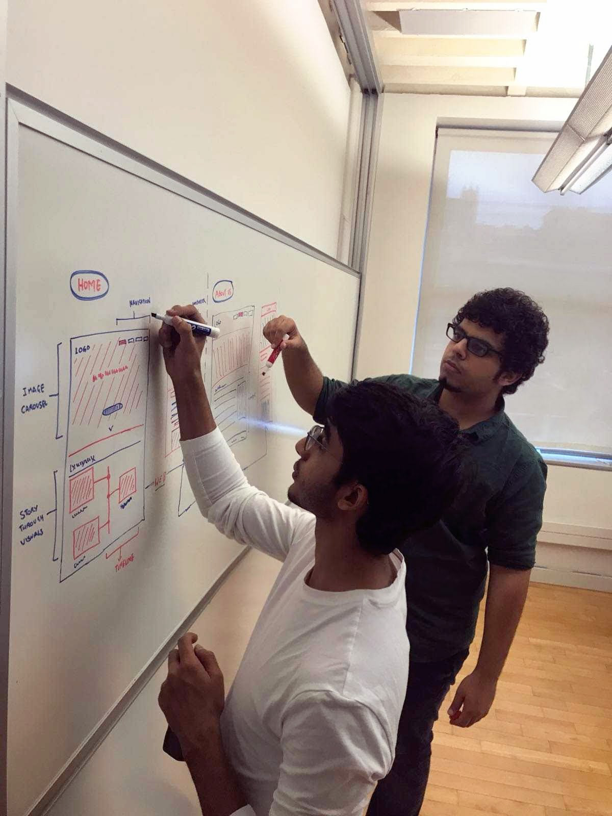
We first began by Brainstorming ideas with all our past learnings in mind and sketched out several ideas on a whiteboard. Then we shortlisted the most interesting and feasible ideas for our next steps:
Low-Fidelity Prototypes
With our Brainstorming session, we discovered good ideas, to move to the next step, which involved creating quick low-fidelity prototypes.
For this step, we began by defining the important user flows based on our research and with focus on the user journeys that were critical to the organization's success. Our areas of focus were:
User flow focus areas
We then designed and built two interactive low-fidelity prototypes that satisfied the selected user flows, one for mobile devices and another for the desktop.
We used Balsamiq Mockups to quickly create the designs and made use of the In-Vision tool to wire them together with respect to the user flows.
Low-Fidelity Prototypes created for both Desktop and Mobile
Prototype Evaluation
Once our low-fidelity prototypes were ready, we moved to the evaluation step, which involved users testing out our prototype and providing their feedback.
We first defined the following tasks that were to be performed by users on the prototypes. These tasks were formulated with respect to our user flows:
Tasks defined for user testing
I performed 2 in-person tests, where I asked users to perform the above three tasks on the prototypes. The users were asked to use the 'think-aloud' method. While they performed these tasks, I observed them and asked questions to gain a deeper understanding of what improvements could be made. The key findings of the user tests were as follows:
Key Findings from Prototype Evaluation
High-Fidelity Prototypes
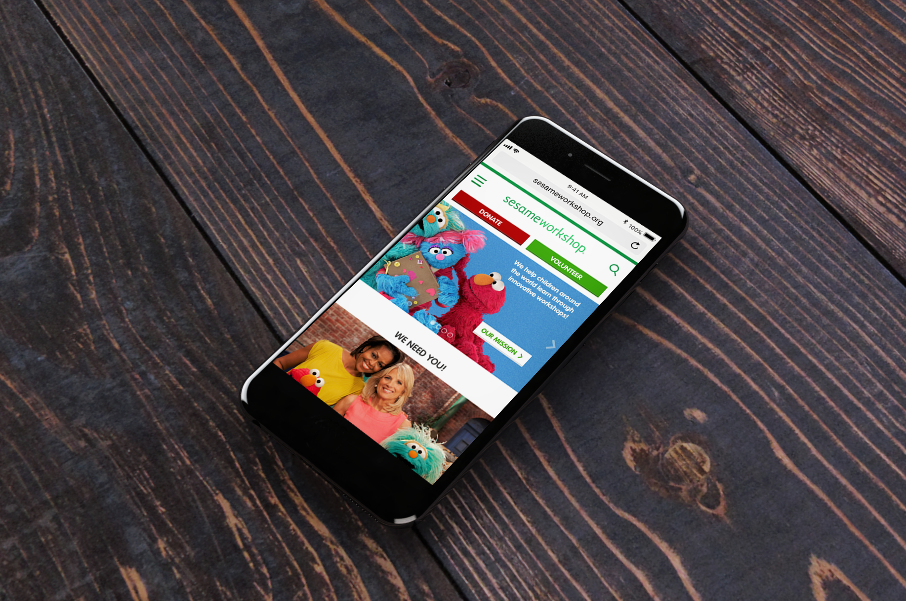
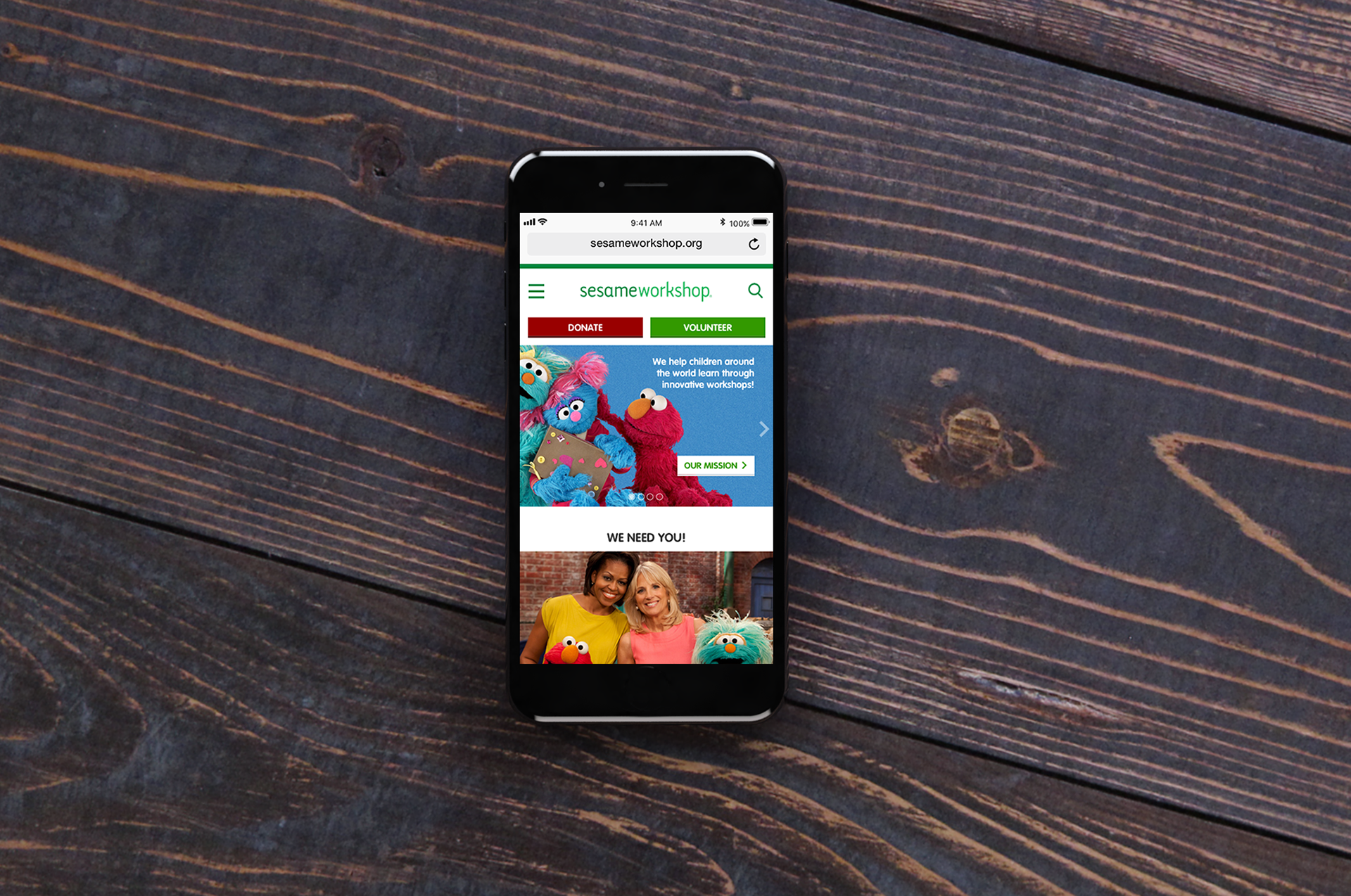
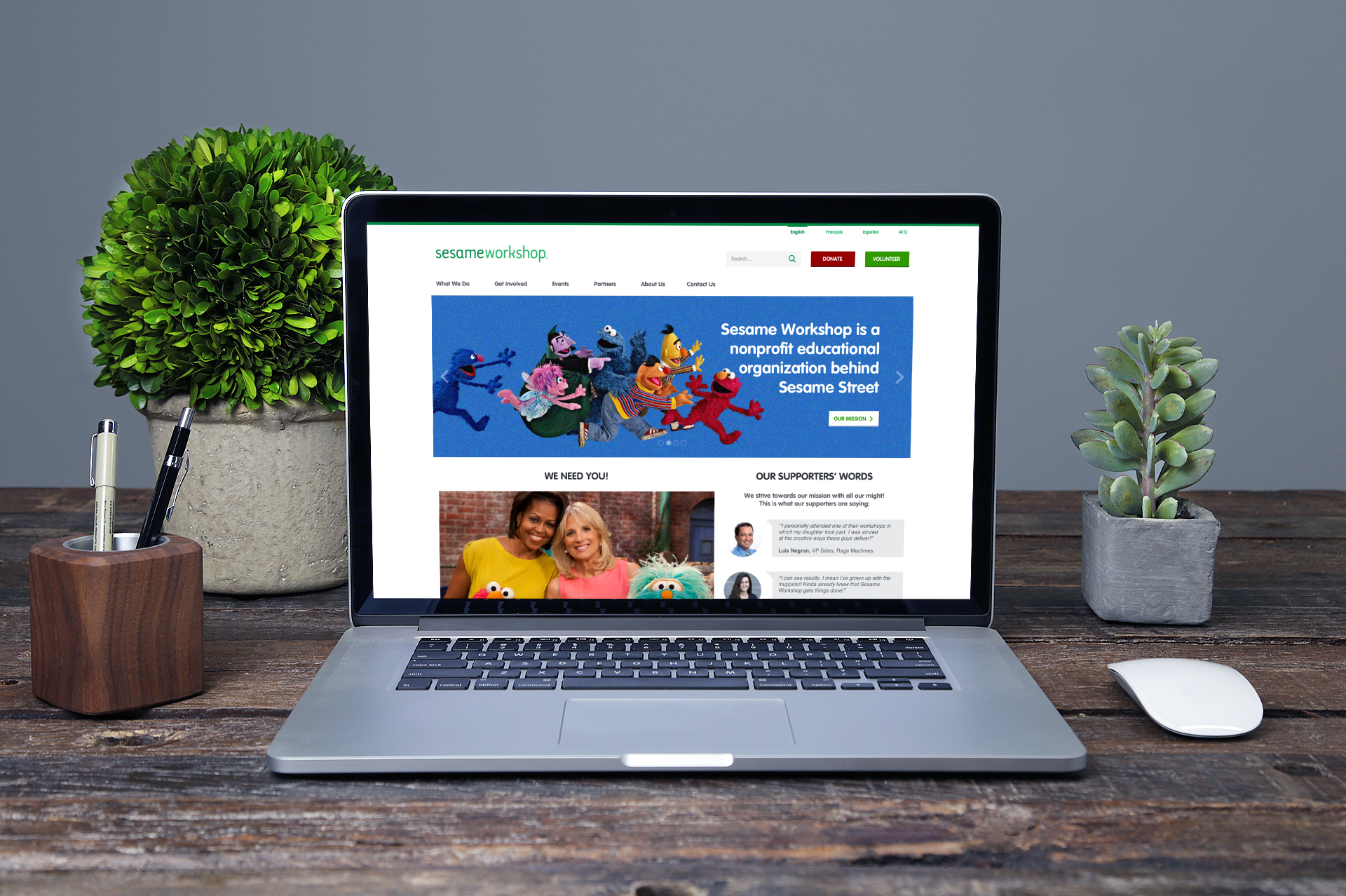
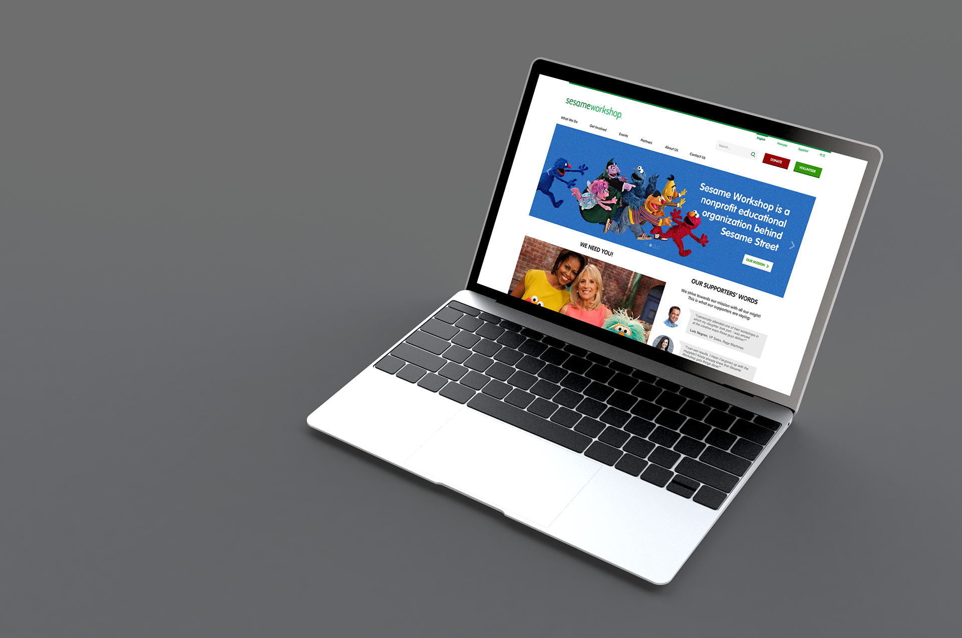
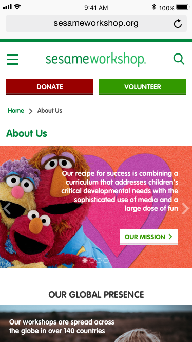
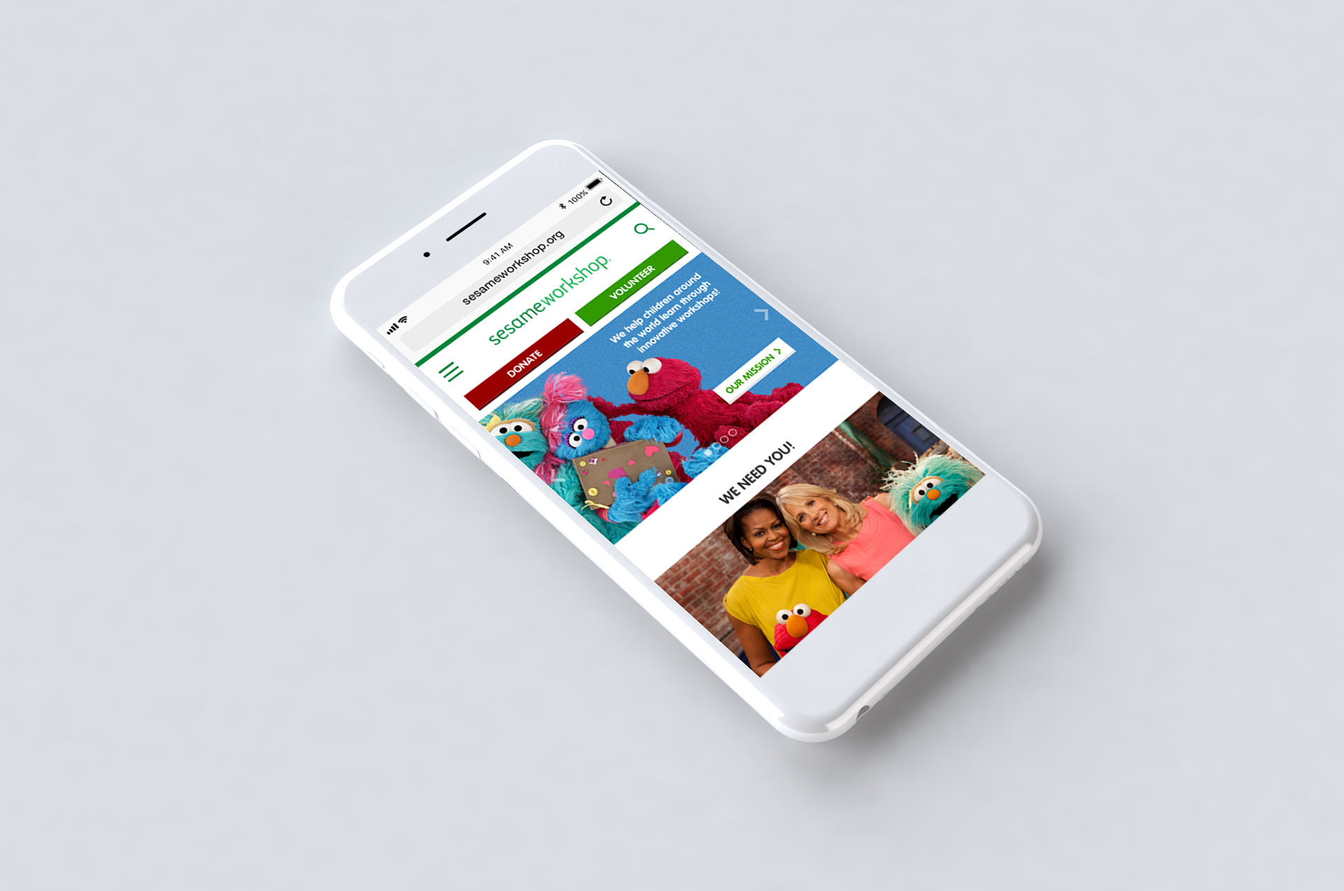
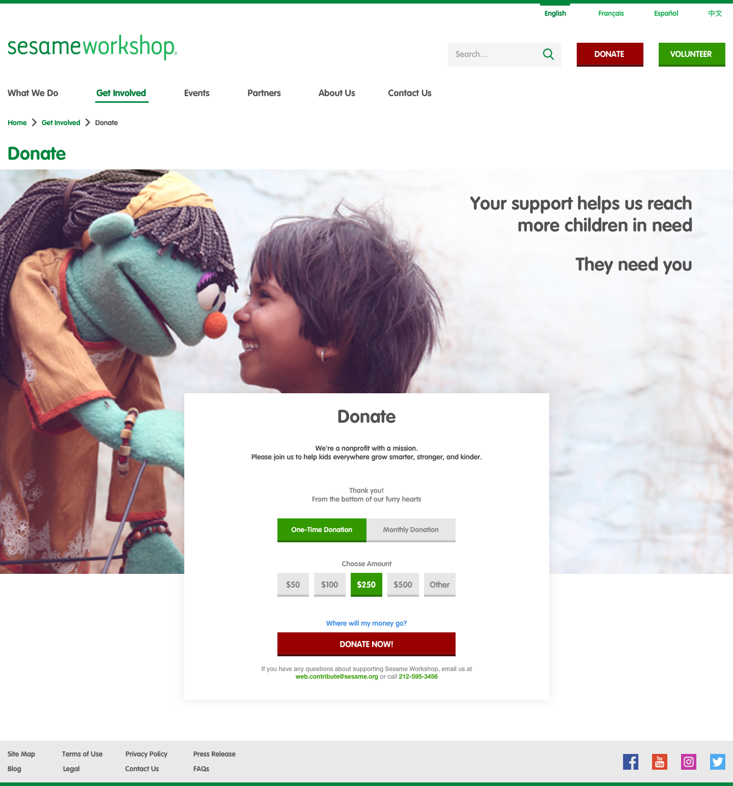
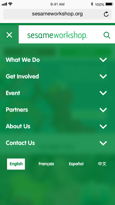
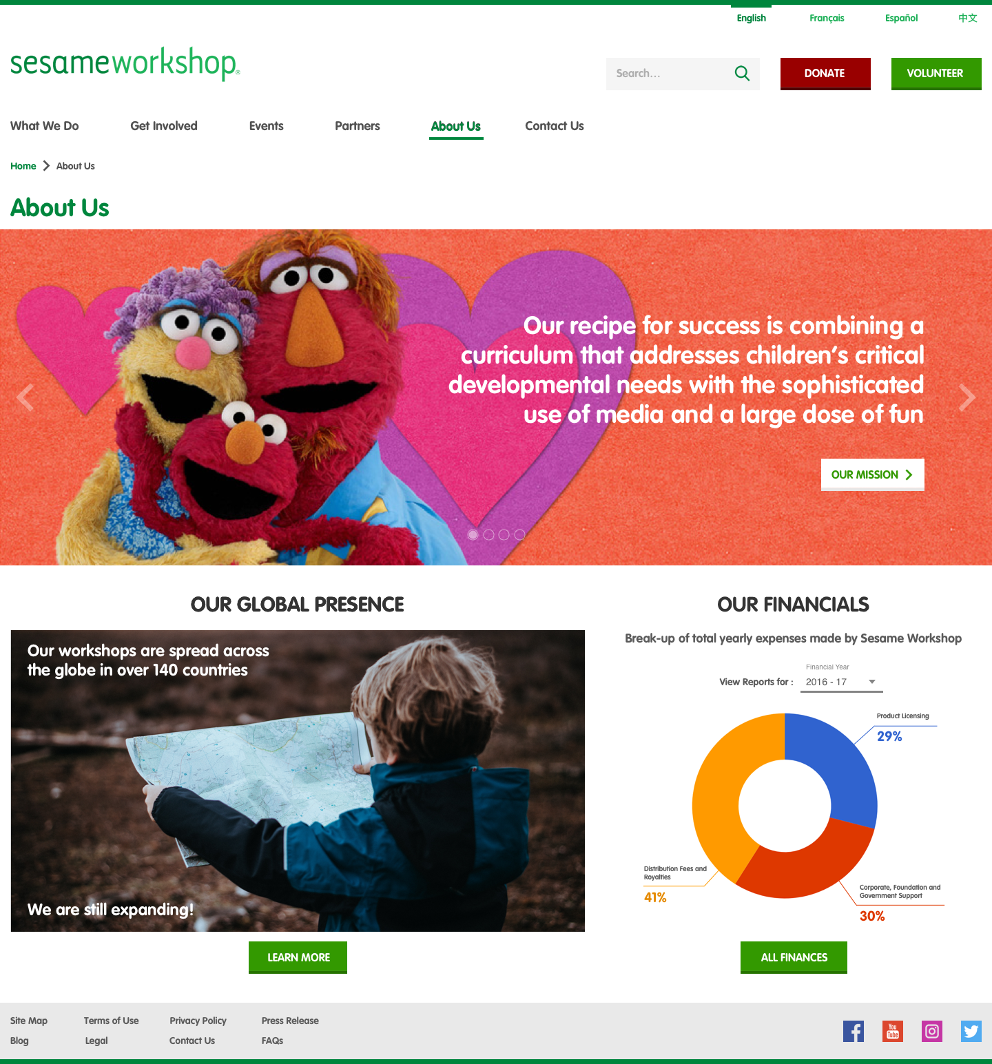
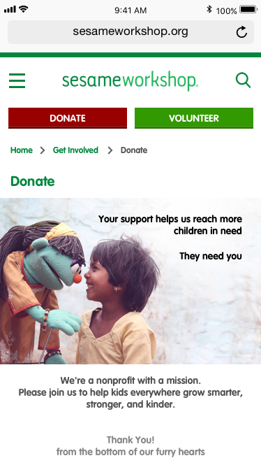
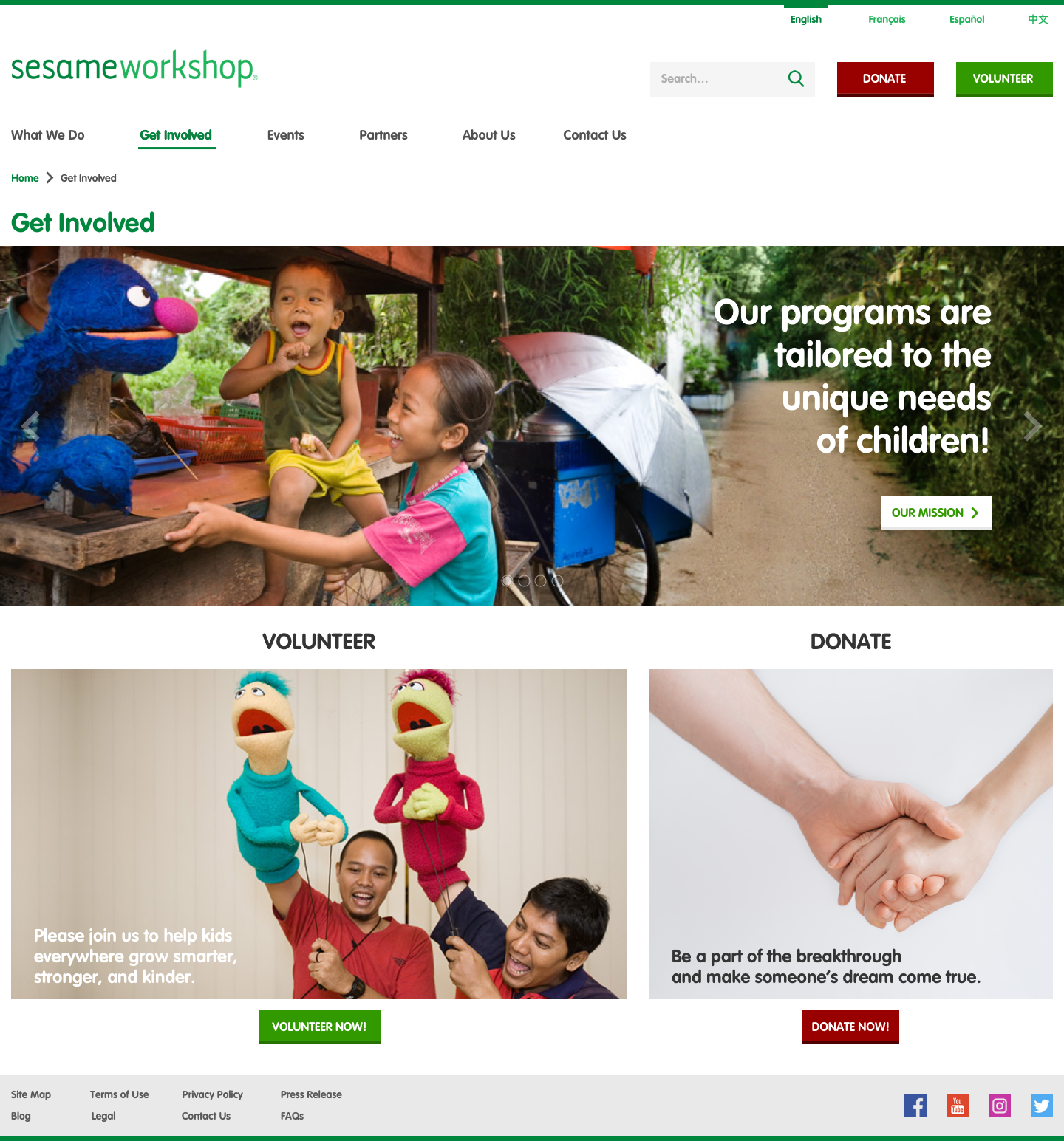
After thorough user testing, we made improvements to the prototypes and then started building the high-fidelity digital prototype. We made use of Sketch App for the designs and Marvel App for prototyping:
FINAL DELIVERABLES IN ACTION
The delivery of our interactive high-fidelity prototypes marked the end of our project. See them in action below:
REFLECTION
The Sesame Workshop redesign project was a great journey focused on designing digital interfaces from a user-centered perspective.
The entire user-centered design lifecycle was covered in this project, from the User Research to conceptualizing Prototypes and then refining them through User Testing in an iterative fashion.
We made use of several powerful design methods aimed at understanding users and their contexts when using Sesame Workshop's website and used trending industry-standard tools to create design deliverables that effectively communicate our insights.
--- THANK YOU! ---


